Maison de Quartier des Eaux-Vives
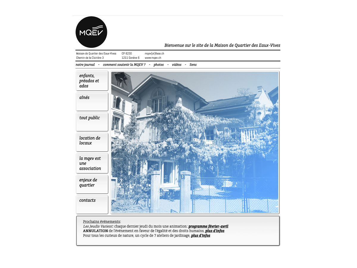
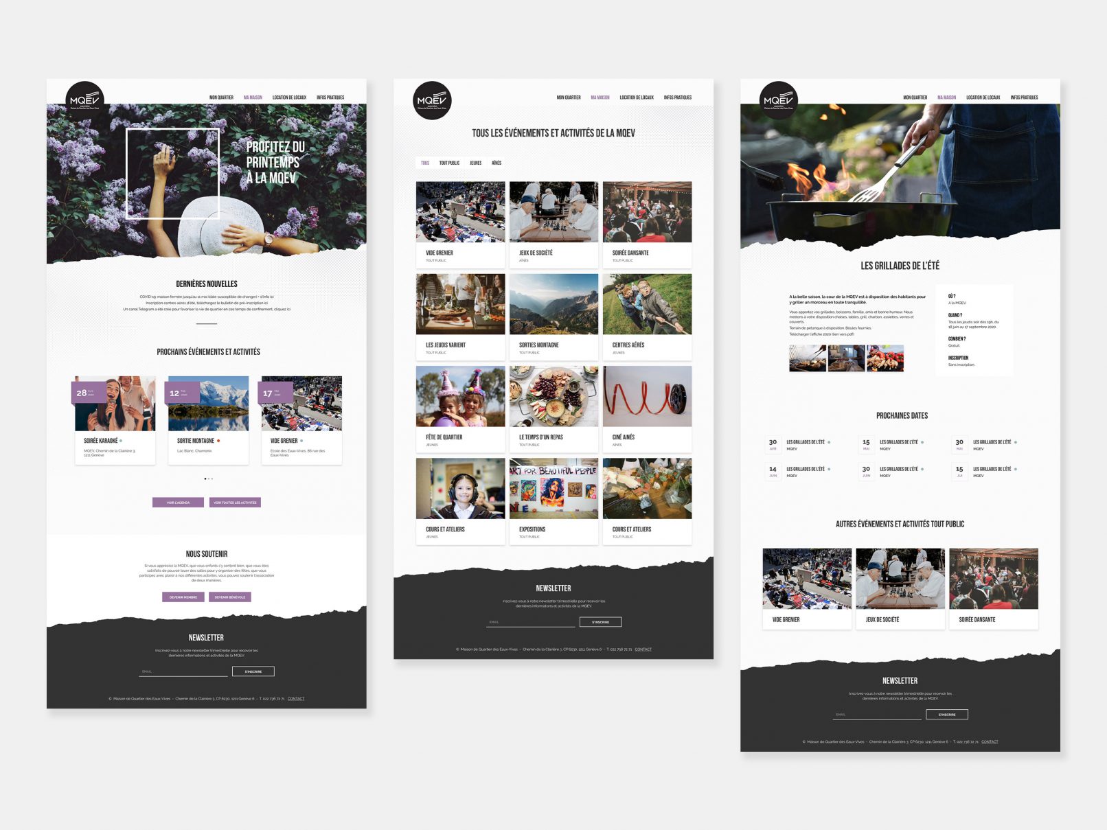
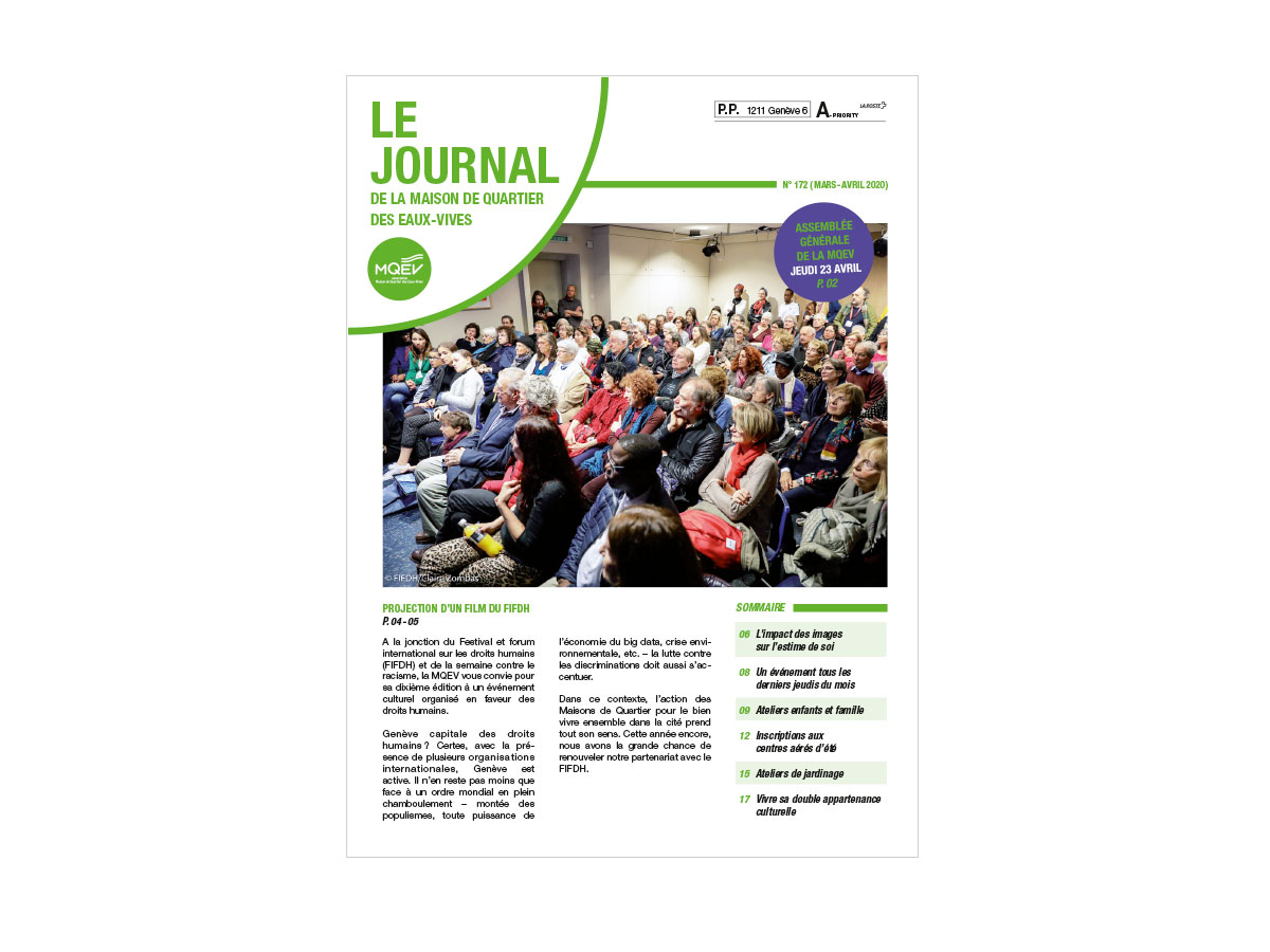
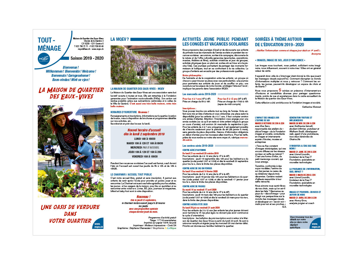
The Maison de Quartier is a community centre in Geneva dedicated to fostering social connection and local engagement. Its previous identity was seen as too corporate, and the goal of this project was to refresh the visual language to feel younger, warmer, and more human. The logo remained unchanged, but every other element was reimagined.
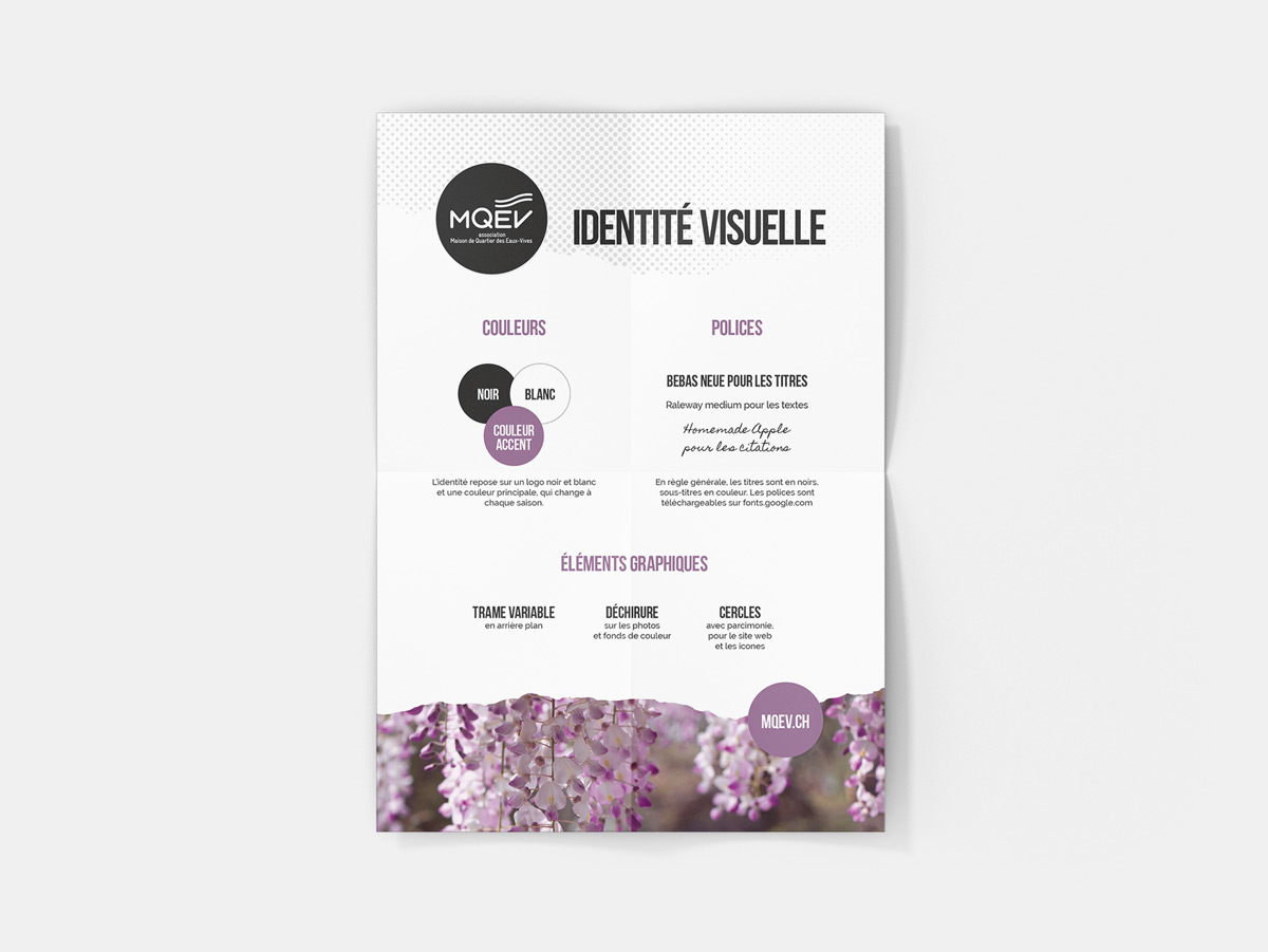
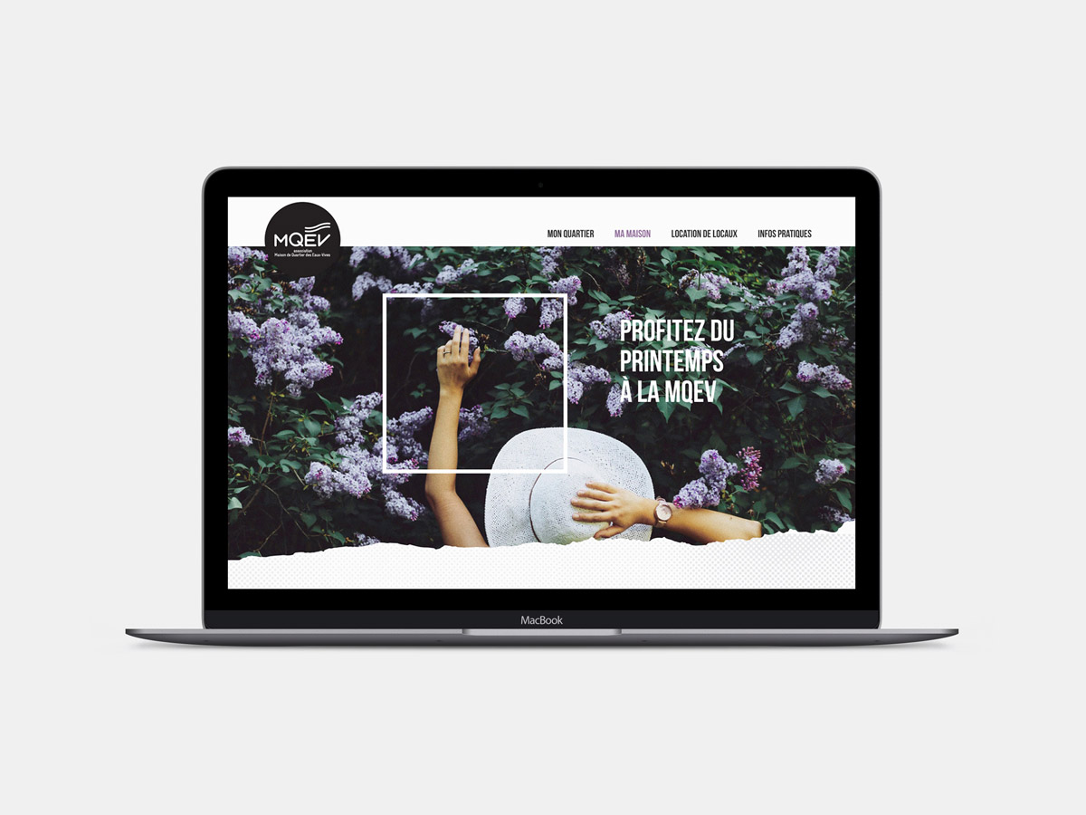
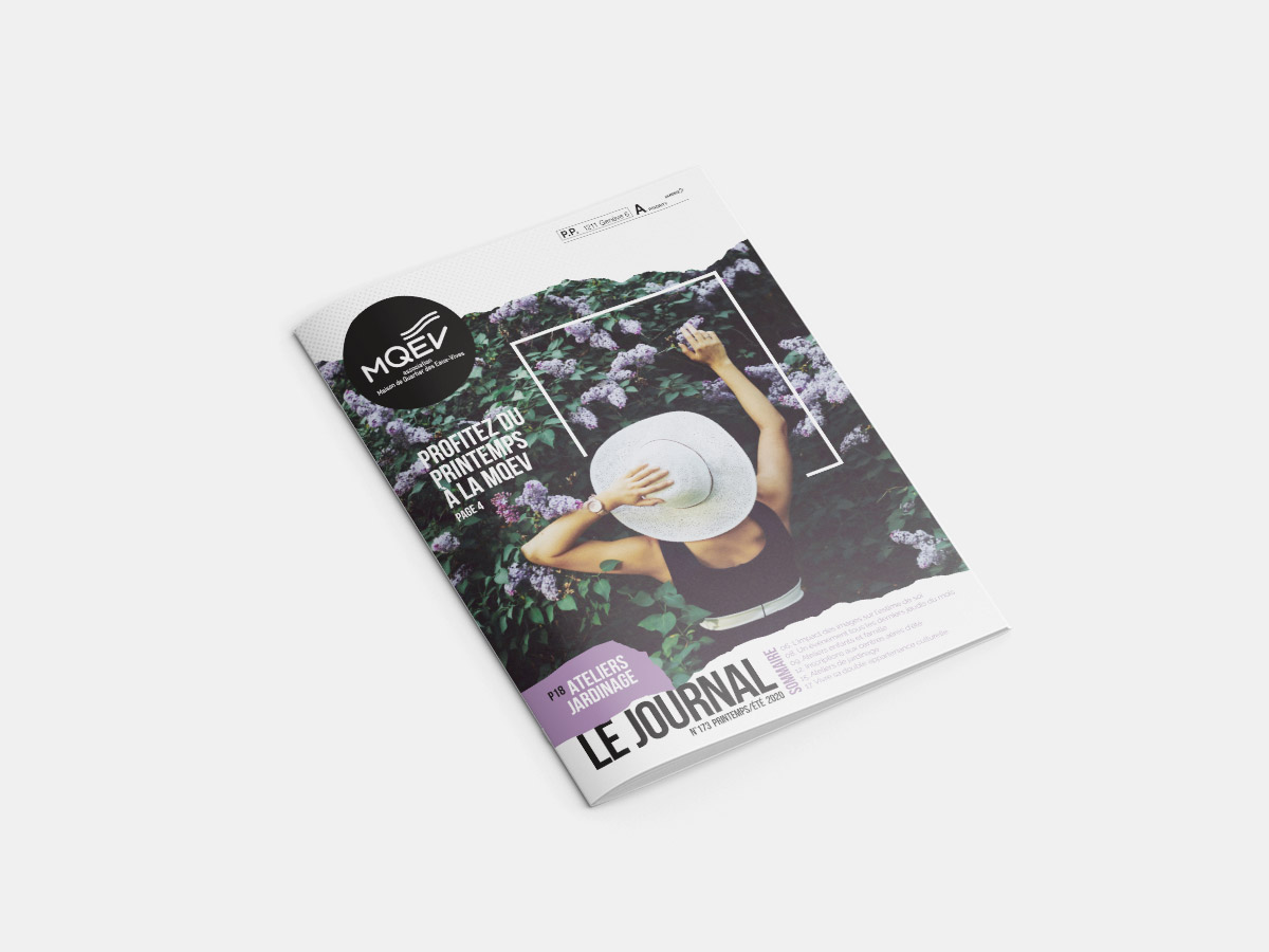
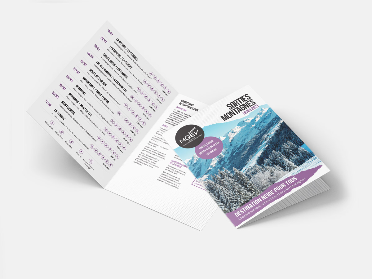
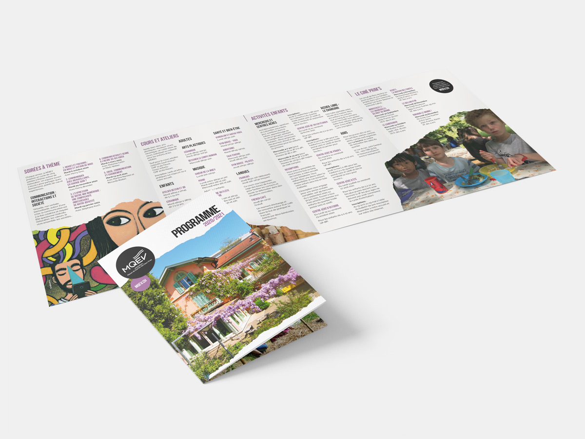
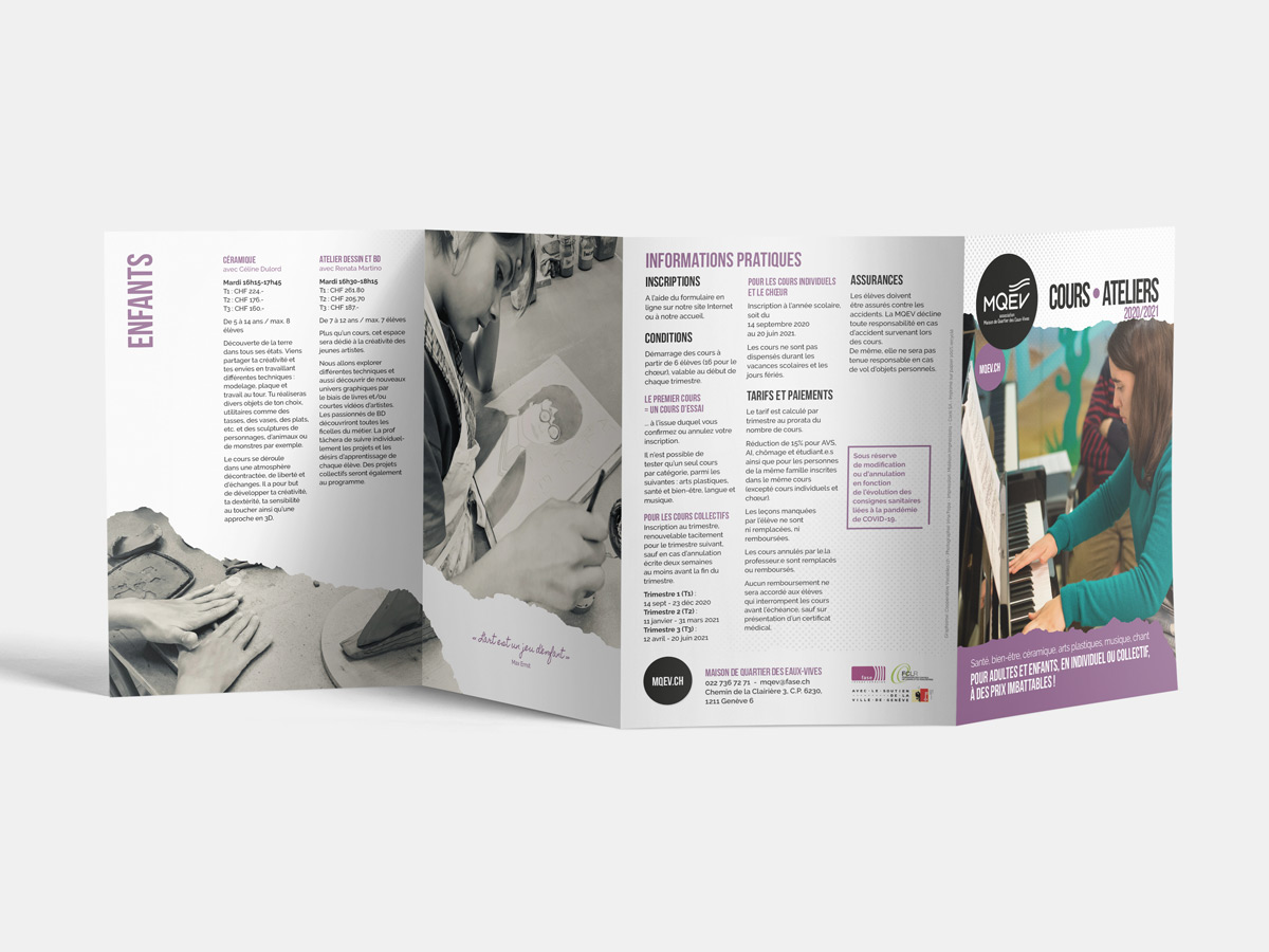
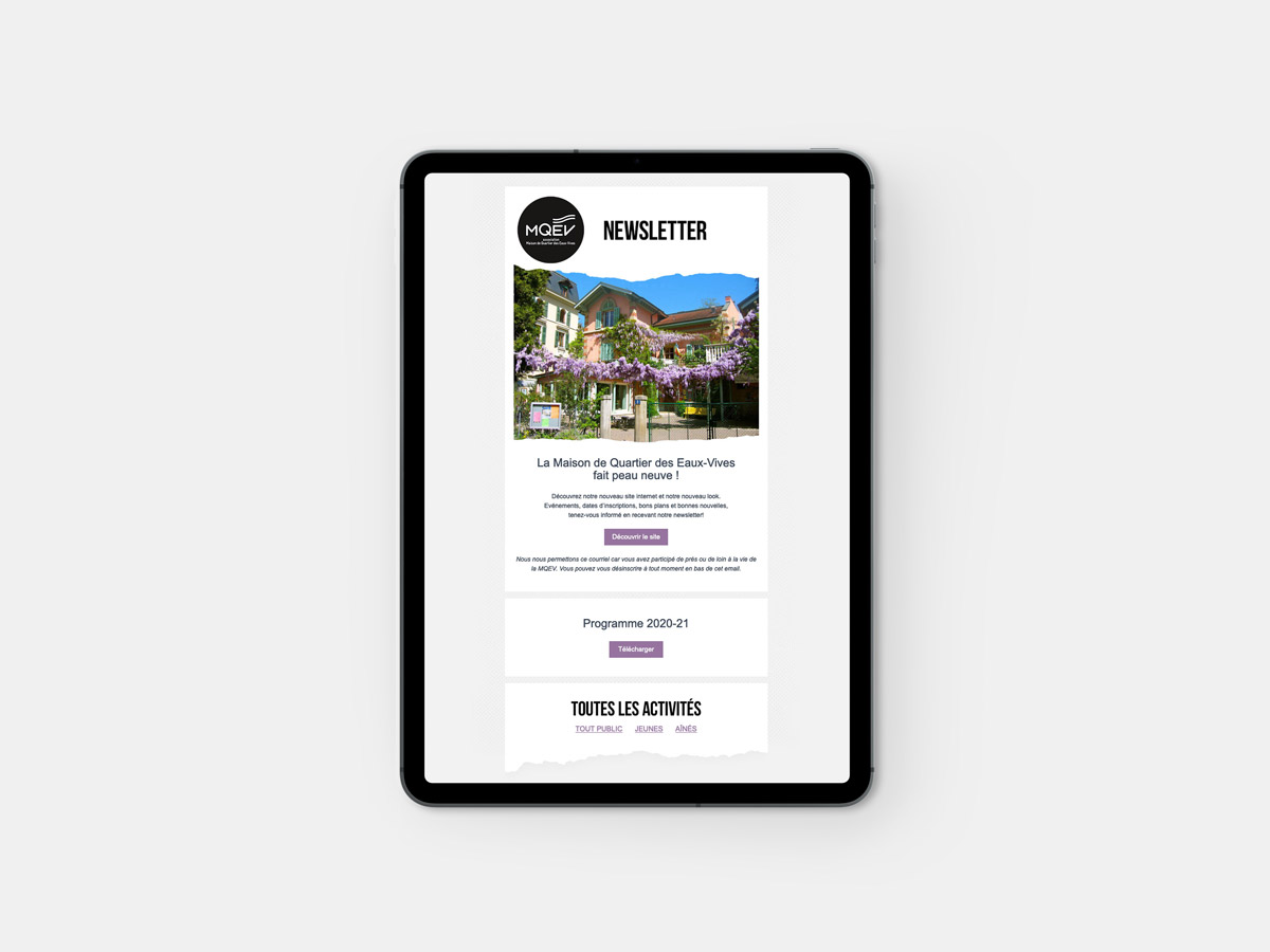
The new design needed to be strong and impactful while expressing the centre’s collaborative, grassroots spirit. A torn-paper effect was introduced as the core visual device, symbolising publications made collectively and by hand. This motif communicates both determination and flexibility, reflecting the centre’s evolving, community-driven nature.
Each year, brochures are reissued to present new activities. To highlight this constant renewal, the primary colour shifts from season to season. The inaugural palette featured purple, chosen as a nod to the wisteria vines covering the front yard of the centre, a local and highly recognisable feature.
The result is an identity that feels approachable, dynamic, and firmly rooted in the life of the neighbourhood.

