Gestalt psychology: 8 principles of visual perception
Everything around us is design. Our visual perception is geared to make sense of it, to grab a cup on a shelf, to drive around a roundabout or to push the buttons on our remote.
Gestalt psychology underlines the mind processes behind our perception. Without these, we wouldn’t be able to discern what we see around us. The Gestalt theories were developed by German psychologists in the 1920s. Gestalt means “unified whole”. They describe how we group elements, identify patterns and perceive objects so that visual information becomes meaningful and usable.
Gestalt principles are core to UX and UI designs, and to design in general! Users must be able to understand what they see—and find what they want—at a glance. Designers use Gestalt principles to achieve this, to build easy to understand and efficient designs, to guide the eye, and sometimes to create surprising effects.

Principle 1: figure-ground
The figure-ground principle states that people instinctively perceive objects as either being in the foreground or the background. They either stand out prominently in the front (the figure) or recede into the back (the ground).
When people use your website or mobile app, one of the first things they do on each screen is to determine which is the figure and which is the ground.
The figure-ground principle is commonly used in logo design because it enables the perception of two or several things at once and often in a subtle way, allowing the designer to keep the simple and clear design needed for a logo. The Toblerone and FedEx logos are clever examples.

Principle 2: similarity
The principle of similarity states that when things appear to be similar to each other, we group them together. And we also tend to think that they have the same function.
A variety of design elements, like colour and organization, can be used to establish similar groups.
The law of similarity is often seen in multicolour logos, where most main colours of the spectrum are used in a shape. It allows the viewer to see the shape in full instead of each coloured element separately, like in the NBC logo, where we can visualise the peacock.

Principle 3: proximity
The principle of proximity states that things that are close together appear to be more related than things that are spaced farther apart.
Proximity is so powerful that it overrides similarity of color, shape, and other factors that might differentiate a group of objects. The Unilever logo is a great example of the variety of shapes put together to form on main object. We would still see the U if each shape had a different colour.

Principle 4: common region
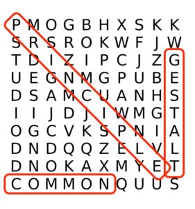
The principle of common region is highly related to proximity. It states that when objects are located within the same closed region, we perceive them as being grouped together. Adding borders or other visible barriers is a great way to create a perceived separation between groups of objects—even if they have the same proximity, shape, color, etc.
We’ve all used this Gestalt principle when circling words in a word search game. On websites we often use it to divide sections, by using a different colour background, or dividers. This is the easiest principle to apply when needing to group things together.

Principle 5: continuity
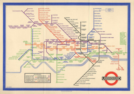
The principle of continuity states that elements that are arranged on a line or curve are perceived to be more related than elements not on the line or curve.
It’s the principle we use when reading, and the Coca-Cola logo illustrates this principle to separate the two words.

Principle 6: closure
The principle of closure states that when we look at a complex arrangement of visual elements, we tend to look for a single, recognizable pattern.
In other words, when you see an image that has missing parts, your brain will fill in the blanks and make a complete image so you can still recognize the pattern.
Your mind fills in the missing information to create a recognizable pattern based on your experience, like the WWF panda.

Principle 7: common fate
The common fate principle states that elements tend to be perceived as grouped together if they move together. It proves very useful in webdesign when using animation. For instance, elements appearing at the same time, or sliding to the sides together, will appear together.
Principle 8: symmetry and order
Put simply, this principle says that a composition should not provide a sense of disorder or imbalance, as otherwise the viewer will waste time trying to locate the missing element, or fix the problem, rather than focusing on the message or instruction.
Image source


