The 3 C’s of a visual brand identity
Brand identity is often reduced to aesthetics.: a logo, a colour palette, a typeface system, assembled, approved, and launched. And for a moment, everything feels right! But a few months later, things start to shift. New materials don’t quite match, social posts feel inconsistent, the tone changes depending on who’s creating the asset… The brand slowly loses its shape. This isn’t a design issue, it’s a structural one.
Because a strong visual identity is not defined by how it looks on day one, but by how well it holds together over time. After working across brand, packaging, and digital systems, one pattern consistently emerges: the brands that last are not the most complex or the most expressive, they are the most disciplined.
They are built on three principles that I refer to as the 3 C’s of brand identity:
- Clear: simple and instantly recognisable
- Consistent: used the same way, everywhere
- Coherent: connected to a deeper purpose
These 3 C’s are operational foundations, and when one of them is missing, the identity begins to break down.
Clarity creates recognition
A brand is rarely experienced in ideal conditions. It appears briefly on a screen, on packaging, in a crowded environment, or in motion. People don’t study it, they register it, and that registration happens in seconds. This is why clarity is what allows a brand to be recognised at all.
Clarity comes from reduction, from deciding what matters and removing what doesn’t. When too many elements compete for attention (multiple colours, decorative typography, layered visual ideas) the identity becomes difficult to process. And what is difficult to process is rarely remembered.
Research in cognitive psychology consistently shows that simpler visual systems are easier to recognise and recall. The brain favours patterns it can quickly categorise. Strong brands leverage this by being deliberate instead of decorative.
In practical terms, clarity means building a visual system that can survive constraints: a logo that remains legible at small sizes, a colour palette that is distinctive, not interchangeable, typography that carries hierarchy without needing constant adjustment… It also requires restraint, which is often the hardest part. Not adding one more idea, one more variation, one more “just in case” element.
Clarity is not about doing less, it’s about doing exactly what is needed, and nothing more.

Brand example:
One of the clearest examples of this is Apple. Its identity is built on reduction: minimal colour, clean typography, and a strict use of space. Across products, packaging and communication, nothing competes for attention. This clarity reinforces what the brand stands for: simplicity, usability, and precision. Even without a logo present, the visual language is often enough to recognise it.
Consistency builds trust over time
Recognition is created through clarity. Trust is built through consistency.
A brand is not experienced once, it is experienced repeatedly across touchpoints, formats and moments. And each of those interactions either reinforces the identity, or weakens it.
Without consistency, even the strongest design work starts to fragment. This is where many brands struggle, not because the identity is poorly designed, but because it is not designed to be used.
Guidelines often exist, but they are either too vague to be helpful or too rigid to be applied. So teams improvise, variations creep in, and over time the brand becomes a collection of approximations.
Consistency requires more than rules, it requires a system. A system defines how elements behave across contexts, how layouts adapt, how imagery is selected, how typography scales. It provides enough structure to maintain coherence, while remaining flexible enough to be applied in real situations.
It’s also important to understand that consistency does not mean rigidity. Formats evolve constantly — what performs today may shift tomorrow, whether it’s a carousel, a video, or a completely new platform. A strong brand identity needs to adapt to these changes to remain relevant and usable. The key is not to reinvent the brand each time, but to evolve it deliberately. When adjustments are needed, they should be clearly defined, documented, and then applied consistently moving forward. In that sense, consistency is not about staying the same — it’s about staying recognisable, even as the brand adapts to how and where it lives.
There is also a behavioural aspect to consistency. The best identities are not only well designed, they are easy to use correctly. They anticipate how teams will work and remove friction from the process.
Over time, it is consistency, more than originality, that makes a brand feel established, reliable, and recognisable.

Brand example:
Consistency becomes even more powerful when it compounds over time, Coca-Cola is one of the strongest examples of this. Its red and white colour system and distinctive typography have remained remarkably stable for over a century. And Coca-Cola’s consistency goes beyond its logo and colour. Its depiction of Santa Claus (dressed in red and white, warm, human, and joyful) has been used consistently for decades, shaping the version of Santa we widely recognise today. Santa existed long before Coca-Cola, but his appearance was not fixed. He was illustrated in different ways, colours, and styles depending on the time and culture. Through repetition, Coca-Cola standardised Santa. That’s the power of consistency.
Coherence gives meaning to the system
A brand can be clear. It can be consistent. And still feel… empty.
This is where coherence becomes essential. Coherence is what connects the visual identity to something deeper: the brand’s positioning, its values, the audience it speaks to, and the role it wants to play. Without that connection, the identity may function but it won’t resonate.
This is often where purely aesthetic approaches fall short. A design may be visually appealing, even distinctive, but if it doesn’t reflect what the brand stands for, it creates a disconnect. And that disconnect is felt even if it’s not consciously identified.
A coherent identity aligns every visual decision with intent. A premium brand expresses restraint, precision, and quality through its typography, spacing, and materials. A playful brand embraces movement, colour, and contrast. A science-led brand leans into clarity, structure, and credibility. These are not stylistic preferences, they are translations of meaning into form.
Coherence also ensures longevity. Trends change, but a well-grounded identity remains relevant because it is anchored in something more stable than aesthetics. It is not trying to look current, it is trying to be accurate.

Brand example:
A strong example of coherence is Patagonia. Its visual identity reflects its environmental positioning in a very direct way. The colour palette draws from natural landscapes, the typography is functional and unembellished, and the imagery consistently focuses on real environments rather than overly polished visuals. Nothing feels decorative or disconnected, every element supports the same idea: durability, honesty and respect for nature.
Why all three matter
These principles do not operate independently.
Clarity without coherence creates something recognisable, but generic.
Coherence without clarity creates something meaningful, but difficult to grasp.
Consistency without the other two simply reinforces confusion.
Strong identities exist at the intersection of all three: they are easy to recognise, reliable in their application, and grounded in purpose. That combination is what allows them to scale across time, platforms and audiences, without losing their integrity.
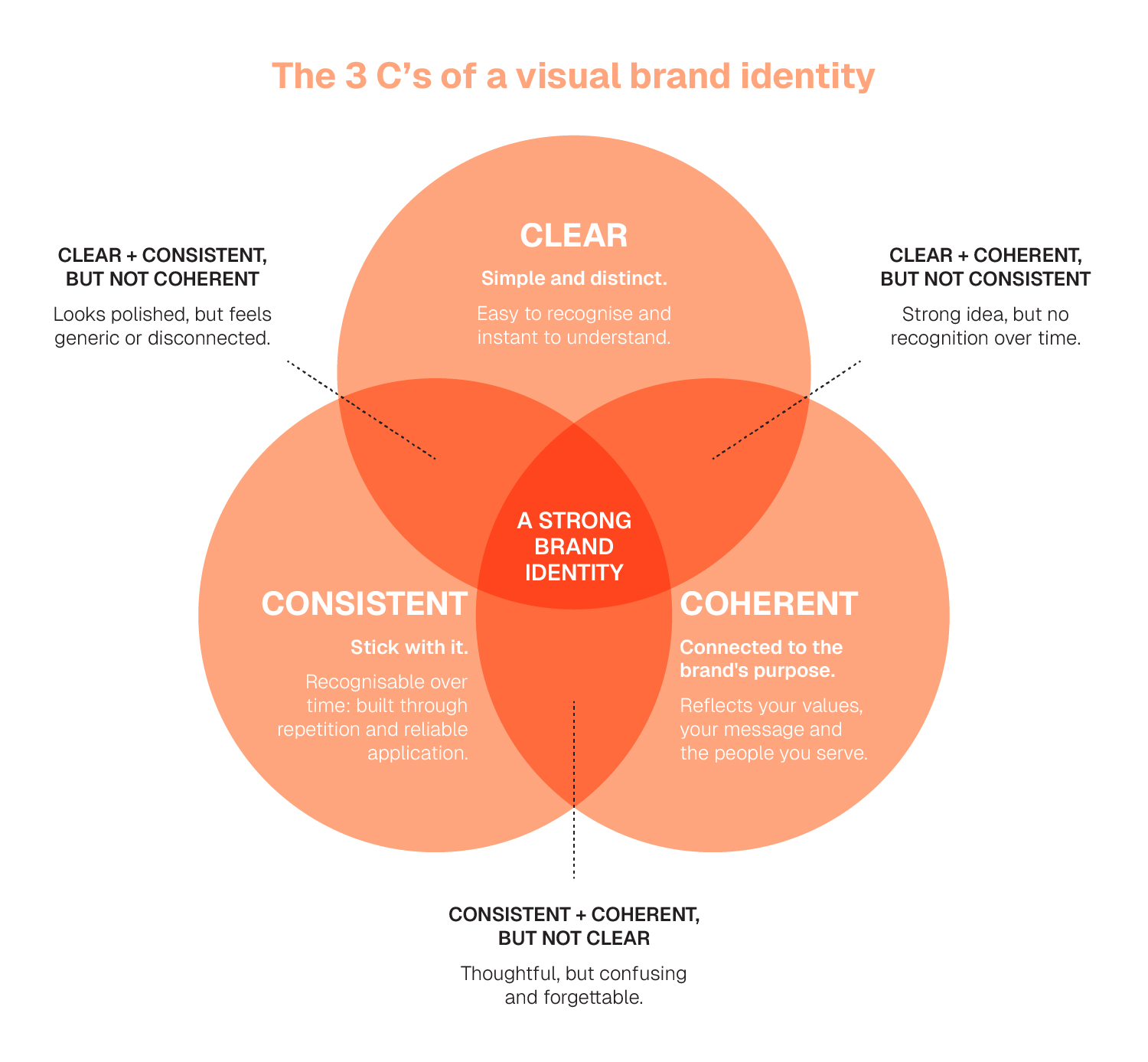
Print this image above as a reference, and before anything goes out, take a moment to check: is it clear, consistent, and coherent?
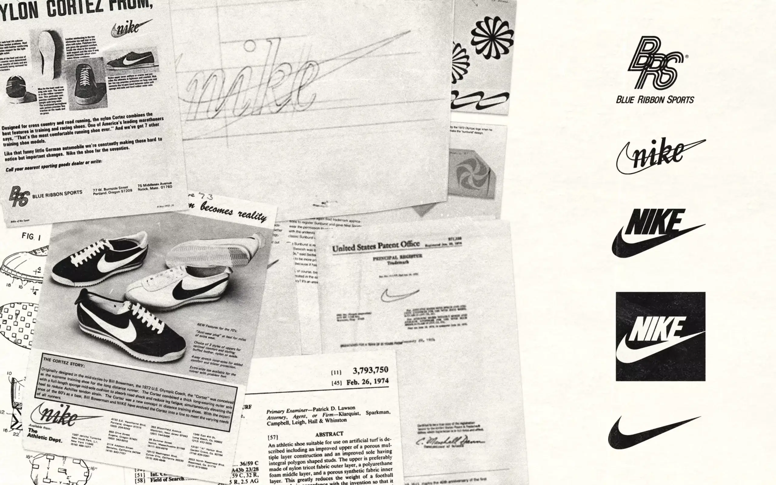
Brands like Nike show what happens when all three align:
Its identity is clear: bold, minimal, instantly recognisable.
It is consistent: applied the same way across campaigns, products, and platforms.
And it is coherent: everything ties back to performance, empowerment, and movement.
It doesn’t adapt its identity to trends, but it adapts its execution while staying unmistakably itself.