Does your website need an update? A 3-step assessment
In our digital age, a website is the main marketing asset of a company. It’s your business card, your brochure, your shop, all in one. But it is also available even when you’re not, and it is easily updatable. Regardless of your budget, customers or industry, you have to have a website. A whooping 97% of people go online to find and research a local business, and 30% of consumers won’t consider a business without a website. And guess what, 75% of people admit to making judgments on a company’s credibility based on website design. And it takes them only 50 milliseconds to make that judgement, just looking at the design.
With evolving trends and technology, a website needs to be refreshed at least every 3 years (update the design and software, enhance security, add functionalities etc), if it has not been constantly maintained.
Here are some tips to check if your website could use an update.
Is it up-to-date?
You might have launched your website a few years back, and surely since then your business has evolved and/or your goals have changed. So, does your website still align with your brand? Does it represent your values well and sends the right messaging to your clients? It might be a good idea to draw a simple list of what is to keep and what it to delete in order to be cohesive with your brand today. Look at the design (fonts, colours, effects) and the tone of voice to assess this.
For the content itself, it’s a quick two-step check:
- Is there obsolete content that needs to be cleared?
- And is there content missing?
Since people rely on websites to find up-to-date and useful information it’s important to make sure they won’t have to search somewhere else and turn to a competitor. An example of this I encounter often is when looking for information about a restaurant. Often the website itself won’t have the menu or opening hours, I end up checking Google and people’s pictures to get an idea of what we can eat there, and it’s quite frustrating, because I never really know if the information is trustworthy. Don’t let that happen to your prospects.
Is it working well?
Firstly, is it responsive? I have to ask, because we can still find websites that aren’t mobile-friendly. It’s critical to have a website that behaves perfectly on mobile for two reasons: 1-the majority of people access websites on their mobile, 2- Google predominantly uses the mobile version of the content for indexing and ranking. You can see here Google’s own guidelines for mobile-first indexing.
Having a fast website will help you decrease your bounce rate and improve your SEO. Check how fast your site loads with Google Page Speed. Don’t forget to check the speed on both desktop and mobile. If your score is low, don’t panic, Google will give you tips on how to improve it.
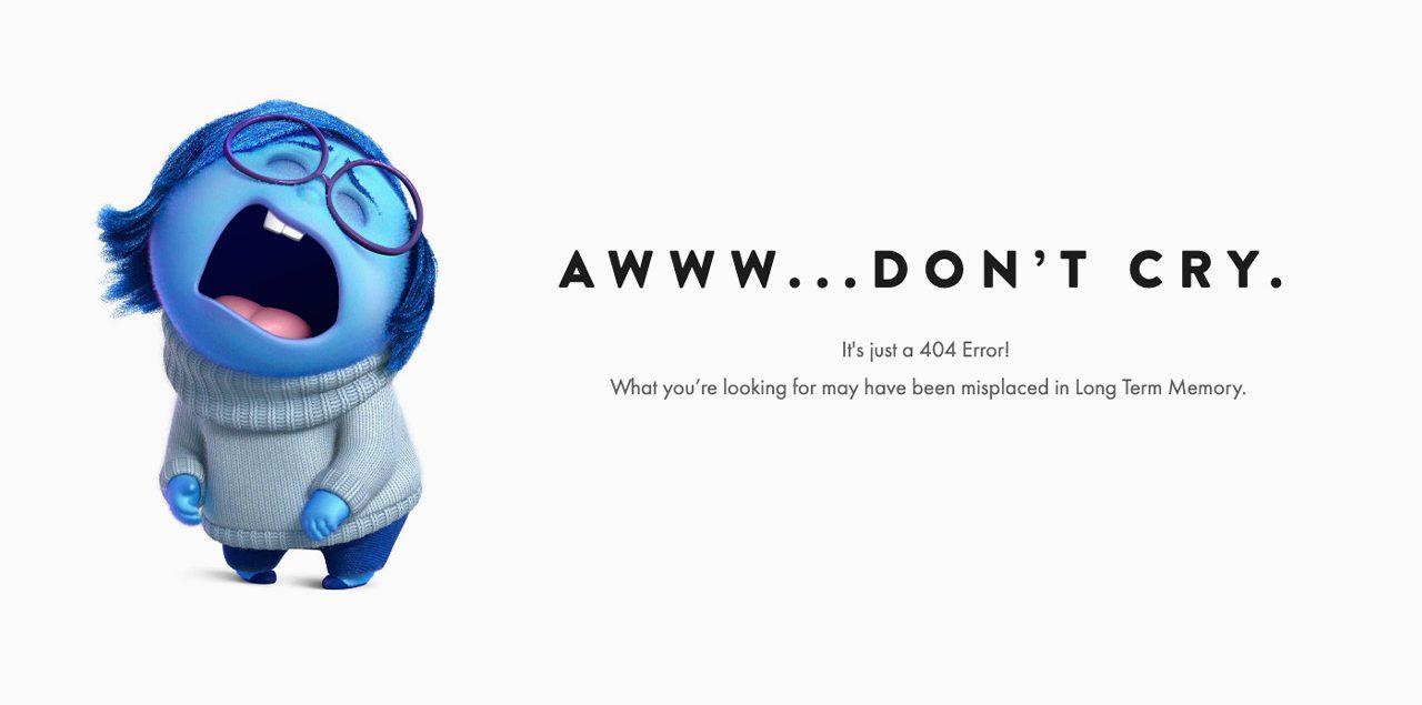
To get a good overview of your websites issues you can use Google Search Console. In the console you’ll be able to see, among others, pages with usability issues (under page experience). You can also find 404 errors under coverage > excluded. It’s important to track and fix 404 errors because they give your users a very poor experience on your site, and they negatively affect your SEO.
Is it accessible?
Ideally all websites should be inclusive and be able to cater for everyone, regardless of their disabilities. The thing is, solutions for accessibility are often the same as for SEO, so that’s a double win. Here are a few examples to watch for:
- contrast must be good for reading and meet the minimum standard. You can check colour contrast with this tool
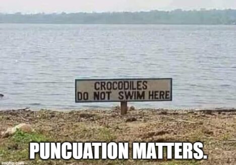
- Don’t put text as images, on top of being an issue for accessibility and SEO, it’s also usually an issue for responsiveness
- Use alternative text for all non text content. The alt text has to describe the image as you would in a sentence (example: woman sitting at a desk and looking at her smartphone while smiling). You can find good tips on this article
- Your website should be operable with only a keyboard
- Your content should be screen-reader friendly (ie. avoid vague links like “click here”) and have a good structure because screen reader translate pages linearly, one element at a time
So, does your website need an update?
Sources: http://digiday.com/media/silent-world-facebook-video – https://www.forbes.com/sites/forbestechcouncil/2018/04/02/visual-content-the-future-of-storytelling/#394cae423a46 – https://venngage.com/blog/lead-generation/ – https://www.nngroup.com/articles/how-little-do-users-read/ – https://link.springer.com/article/10.1007/BF02765184 – https://www.jeffbullas.com/6-powerful-reasons-why-you-should-include-images-in-your-marketing-infographic/ – https://www.bluecorona.com/blog/do-i-need-a-website/ – https://www.forbes.com/sites/gabrielshaoolian/2018/08/10/10-marketing-web-design-branding-statistics-to-help-you-prioritize-business-growth-initiatives/#2470cd73d708 – https://venngage.com/blog/visual-content-marketing-statistics/


