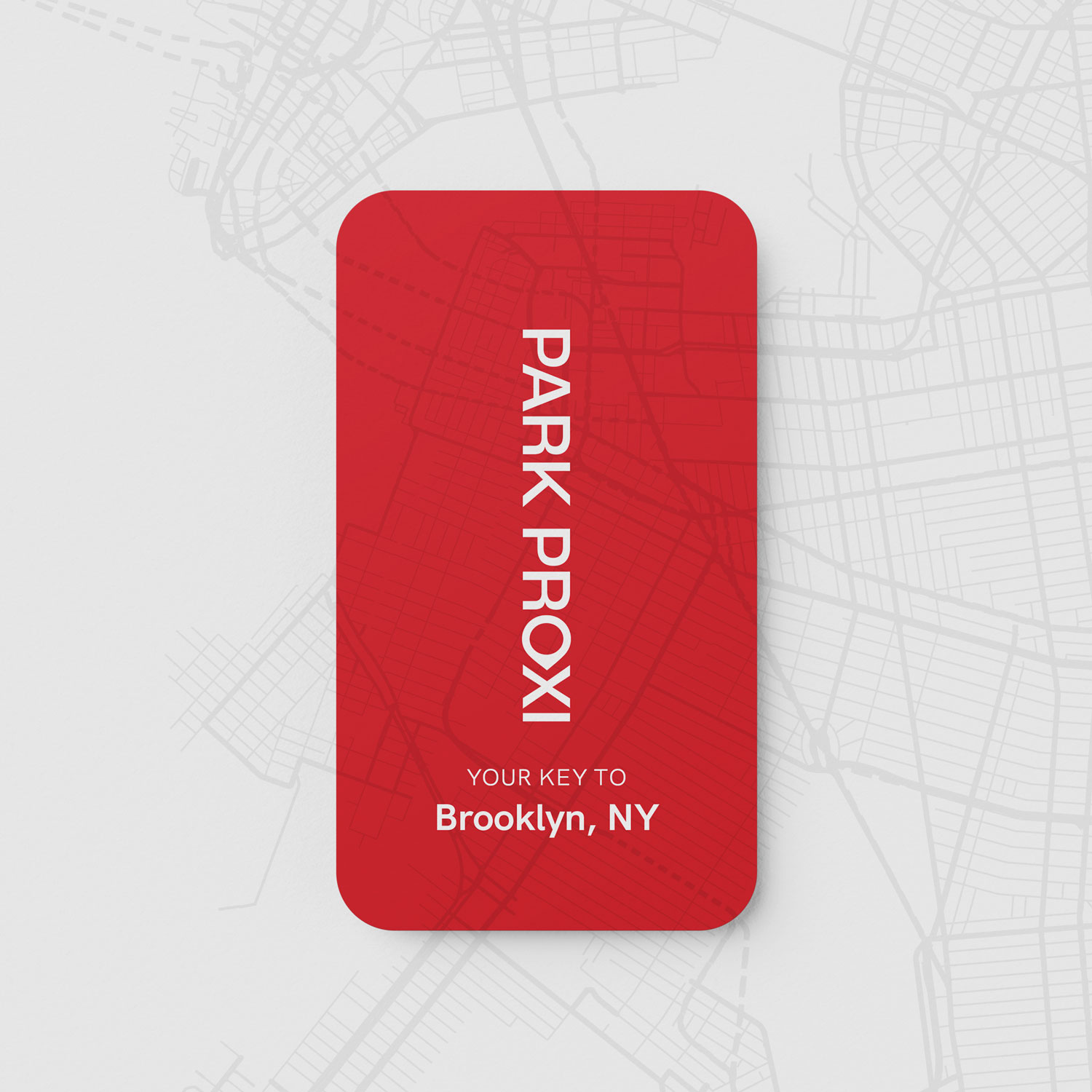
Park Proxi
Park Proxi is a new hotel brand within the Seibu Prince group. Designed to immerse guests in the neighbourhoods they visit, each Park Proxi hotel is intended to be as unique as its local surroundings.
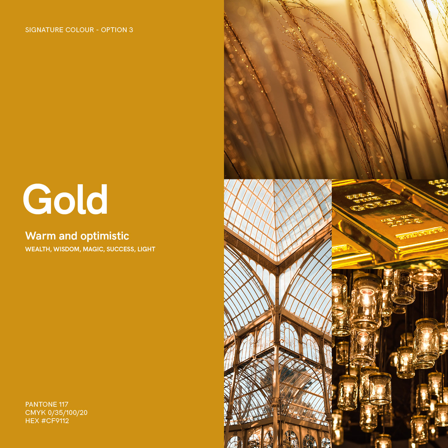
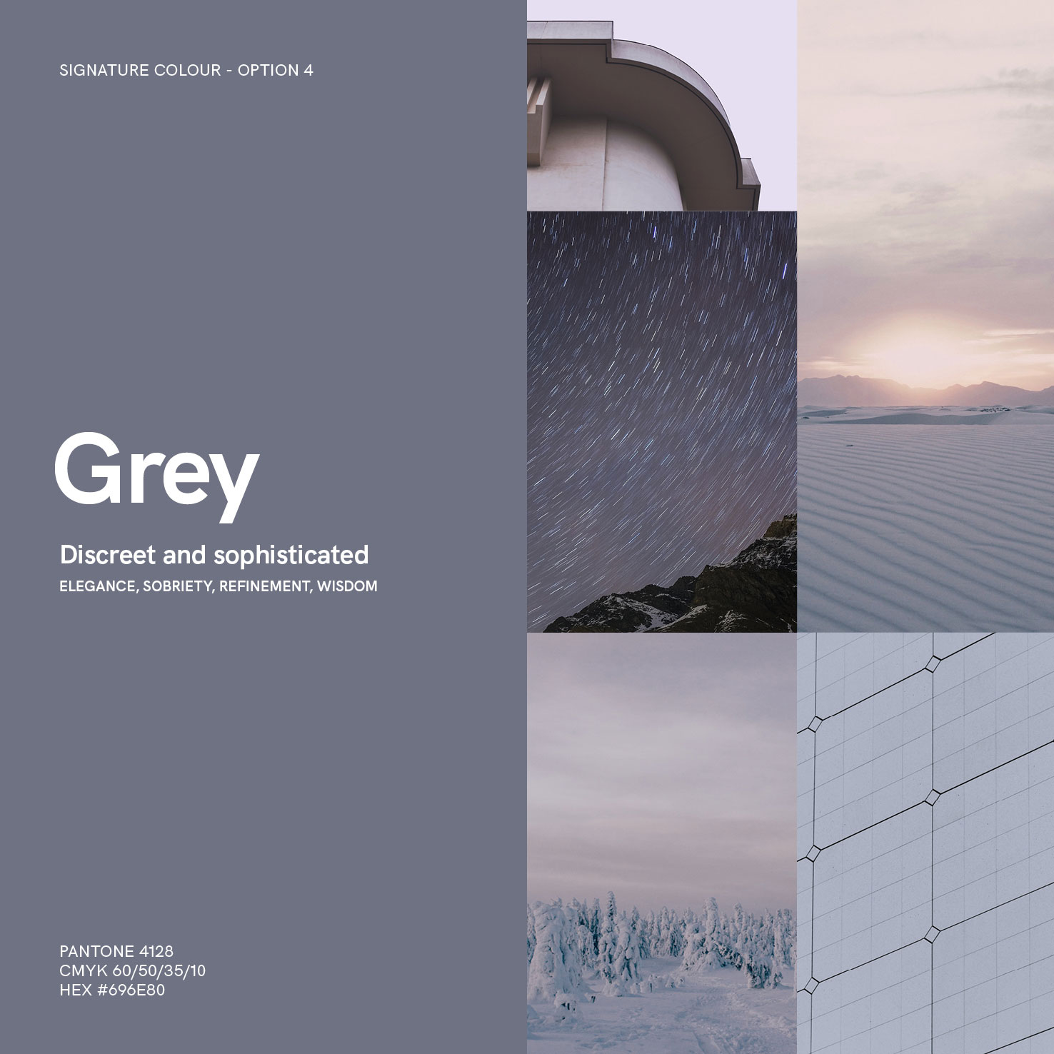
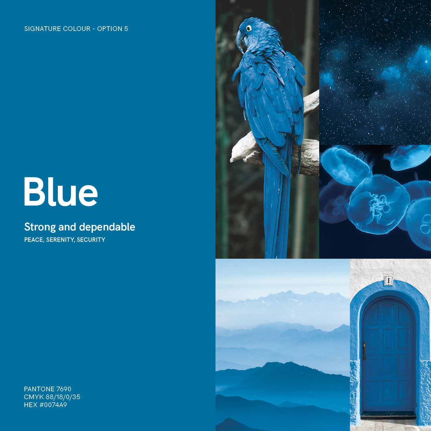
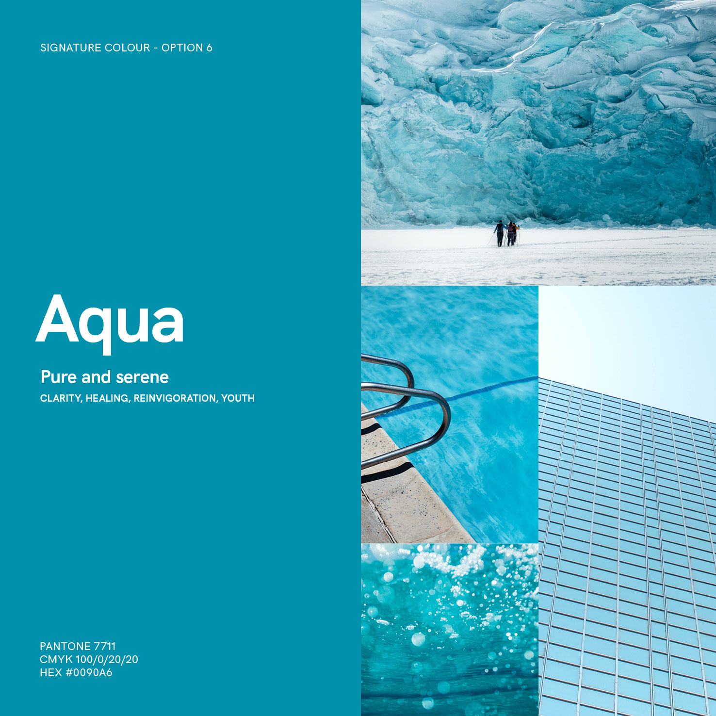
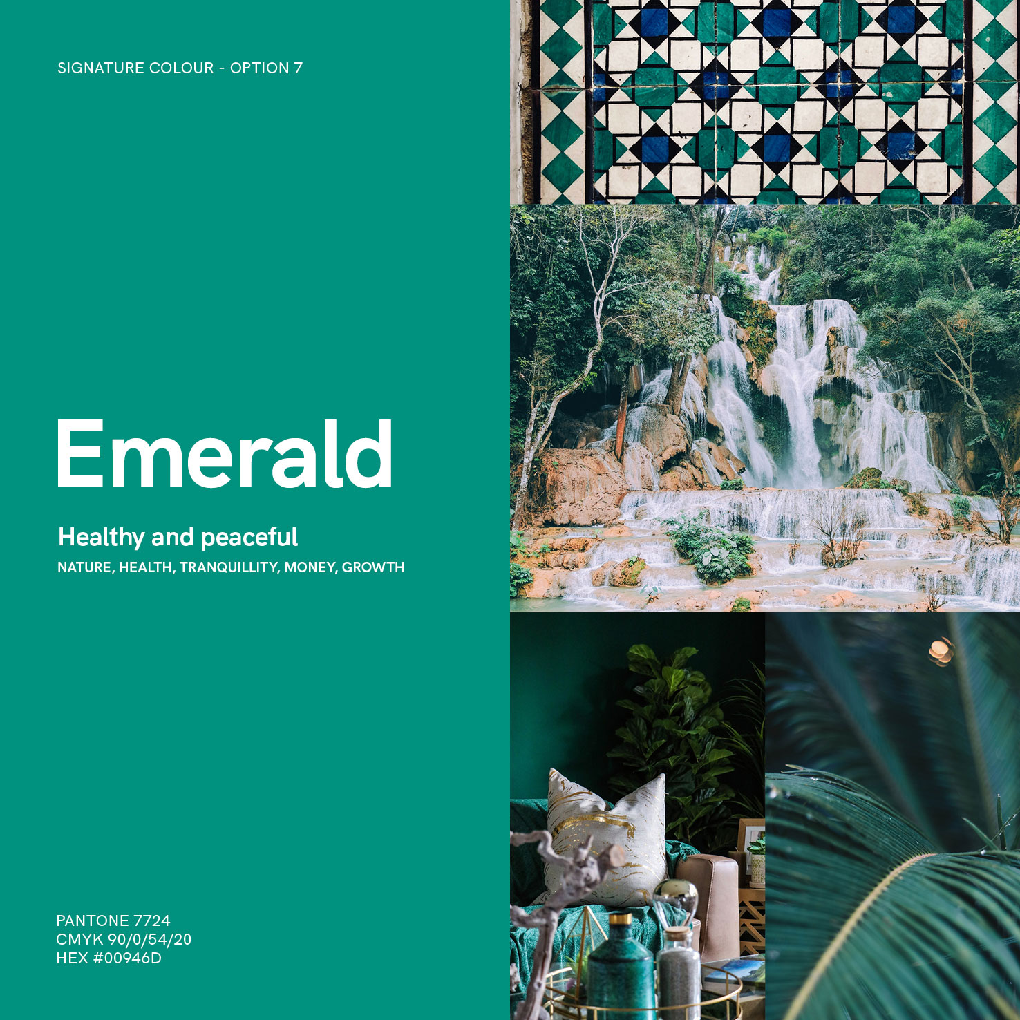
To support this vision, the identity system introduces a market-first idea: every hotel owner can select a bespoke Signature Colour, applied consistently across collateral, signage, and as inspiration for interior design. A curated spectrum of warm and cool tones ensures flexibility for properties around the world.
The visual language balances a clean, contemporary design with the vibrancy of local culture. Colour, typography, and iconography were developed to adapt seamlessly from one location to another, creating a strong parent brand while leaving space for individuality. This flexibility ensures the brand always feels both global and distinctly local.
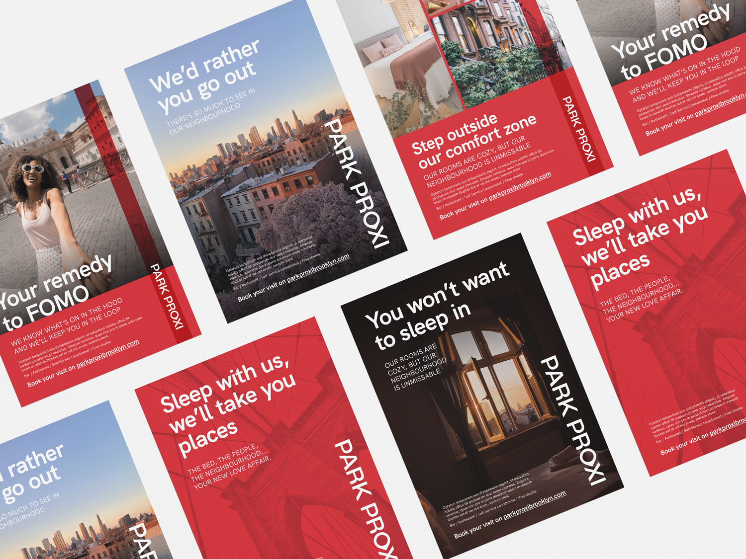
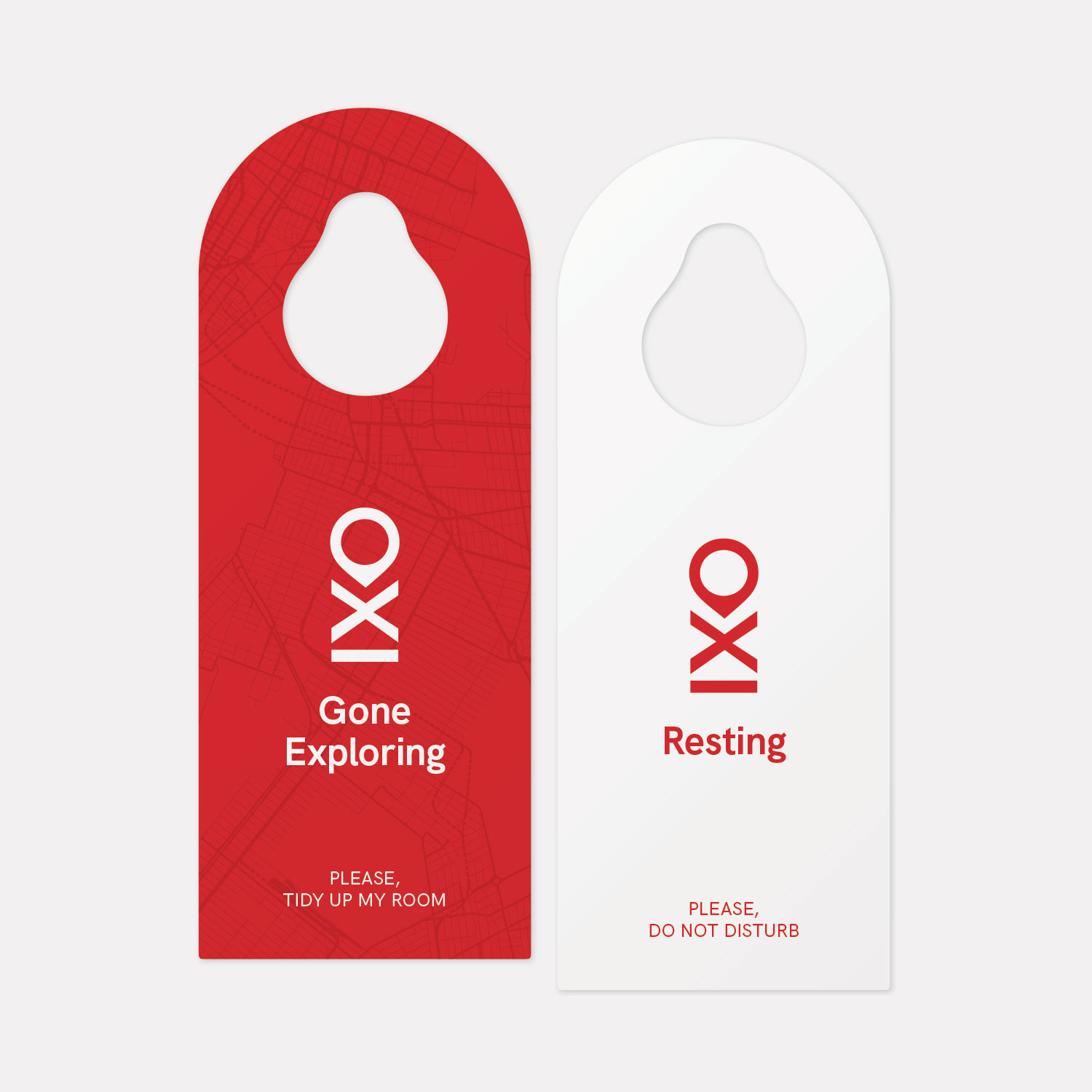
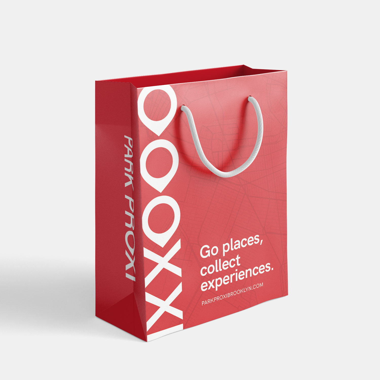
The brand speaks directly to curious, adventurous travellers, encouraging them to step beyond the hotel doors and explore like locals. Communication materials were crafted with this in mind, offering gentle prompts to discover the culture, food, and stories of each neighbourhood. Together, the design and messaging create a vibrant, adaptable identity that positions Park Proxi as a true companion for exploration.
The logo design aims to convey the Park Proxi promise: to help every guest experience the very best each neighbourhood has to offer.
The Park Proxi hotel brand is composed of seven Signature pantone colours to offer owners the opportunity to develop a hotel that suits not just their personal tastes, but also cultural preferences.


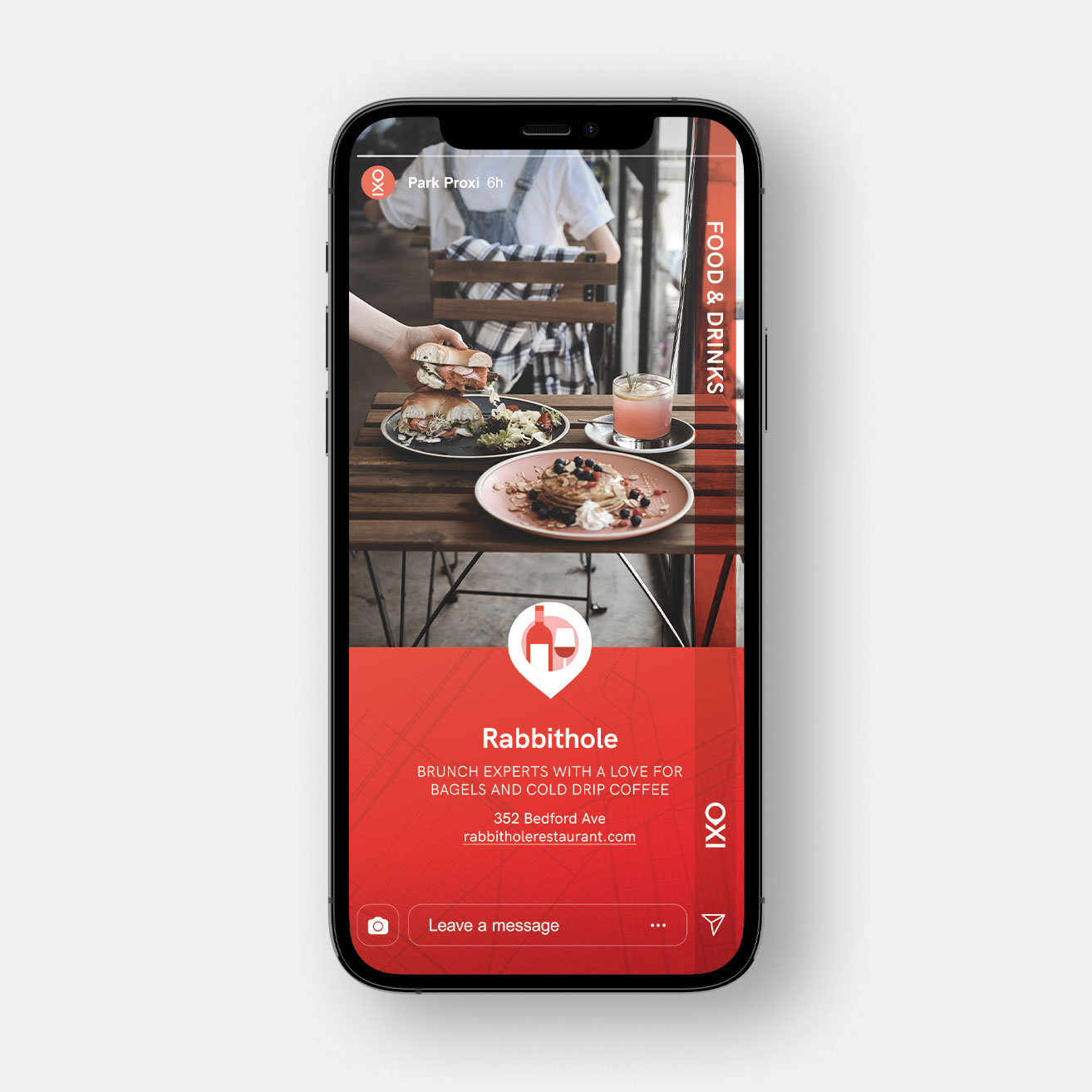
Using a friendly tone of voice, Park Proxi encourages the hotel guests to go out and explore.
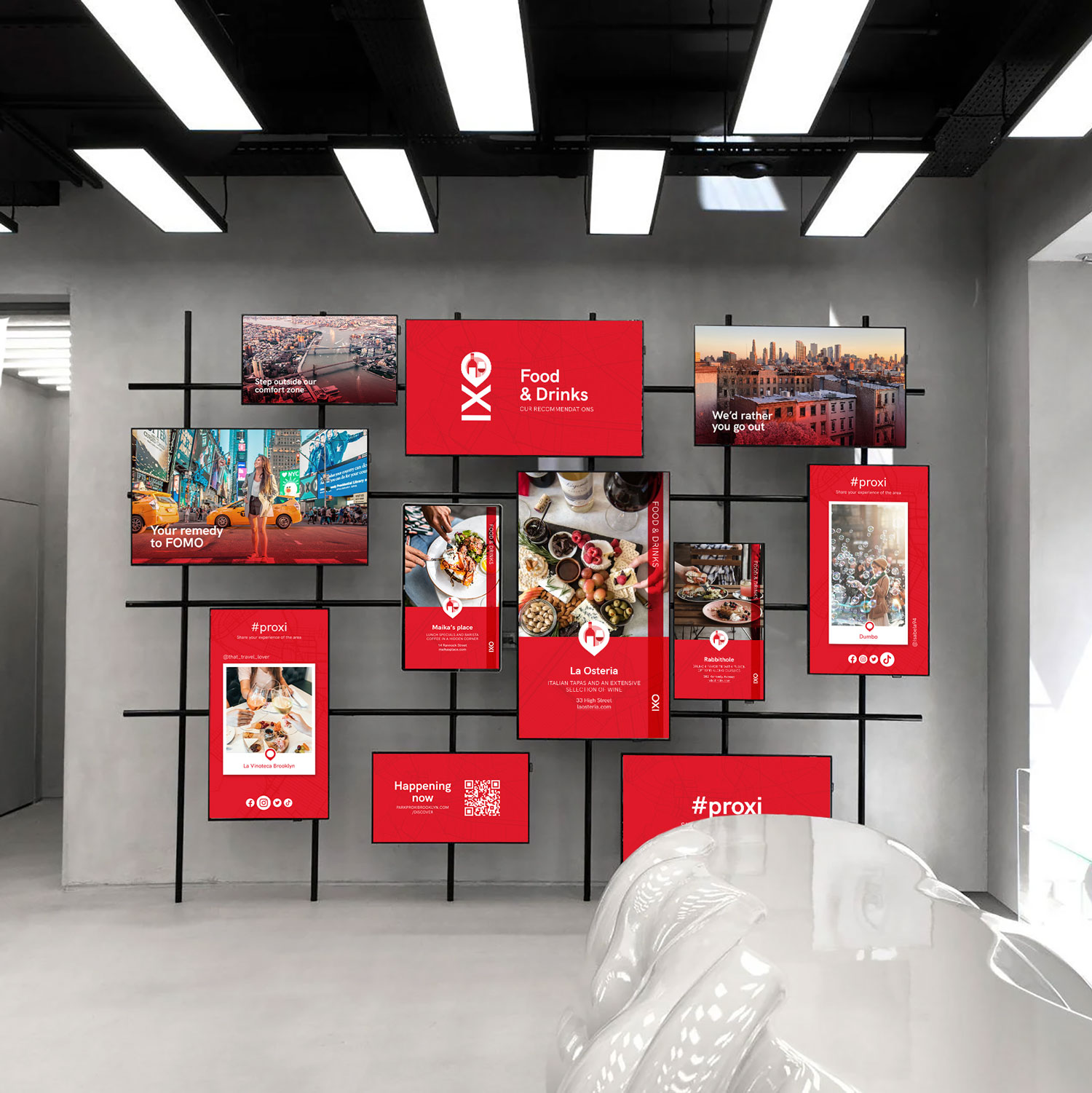
The Park Proxi wall displays information for the traveler: from what’s happening around to general tips about the neighbourhood and live snaps from fellow explorers.