Park Regis by Prince
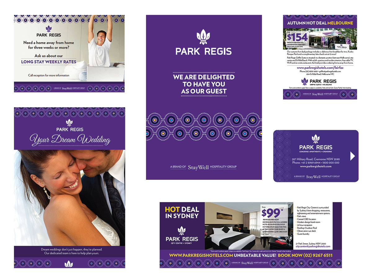
Park Regis, a long-established hotel brand, began a new chapter as it transitioned to Park Regis by Prince, following its integration into the Seibu Prince Hotels & Resorts group. With the brand repositioned as upscale, The Medicine Man Consulting Services led the strategy, while Origami was entrusted with bringing this new direction to life through a refreshed visual identity.
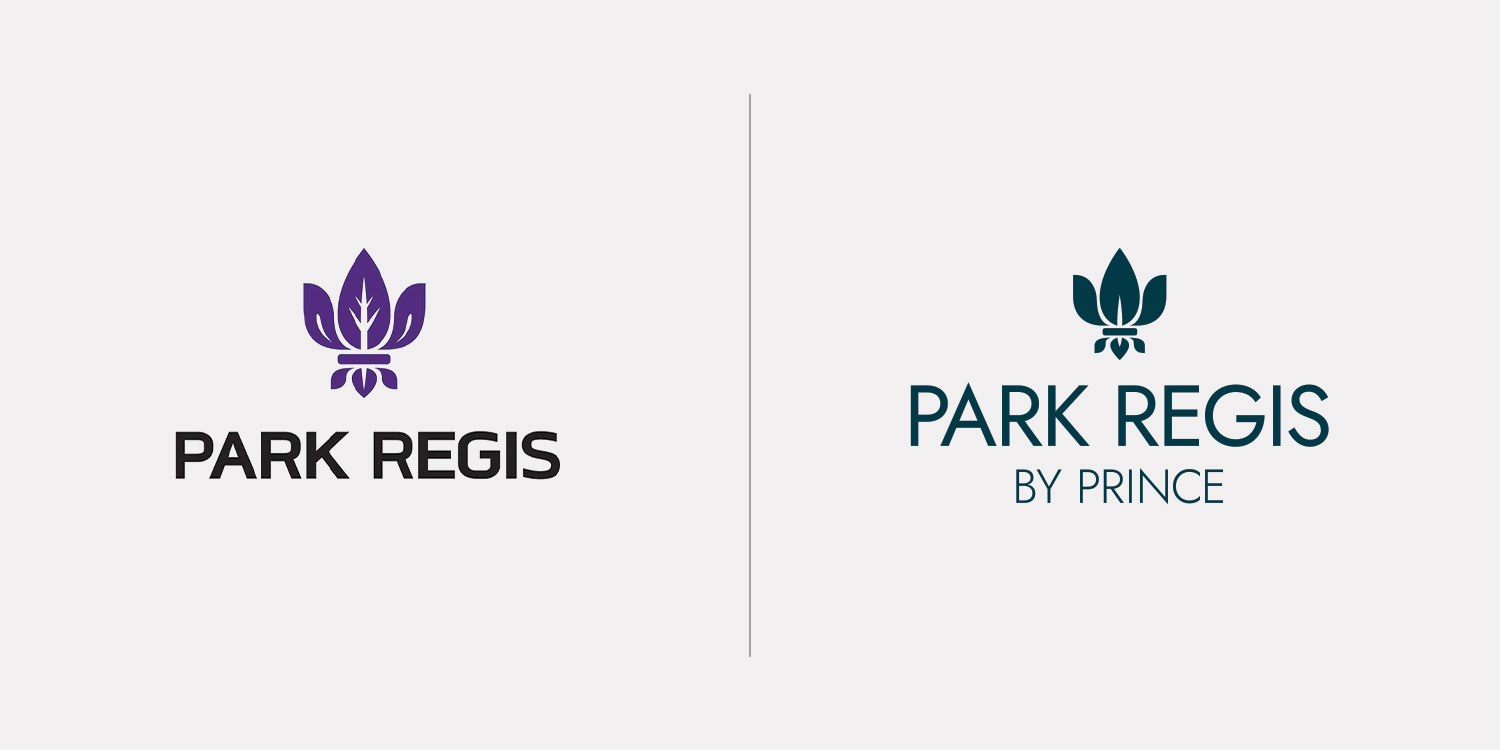
Although the initial request was to retain the existing logo, identity proposals included a refined evolution that ultimately convinced the group. The result is a contemporary interpretation that respects the brand’s heritage while elevating it to meet the expectations of a modern, premium audience.
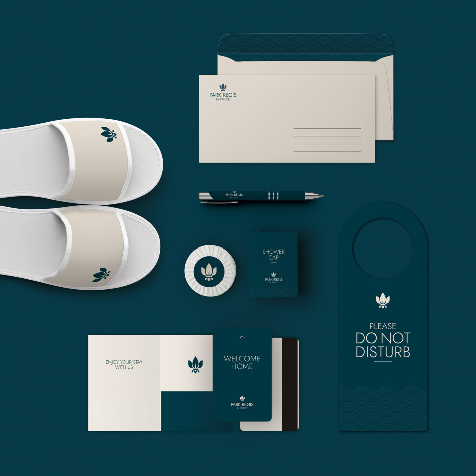
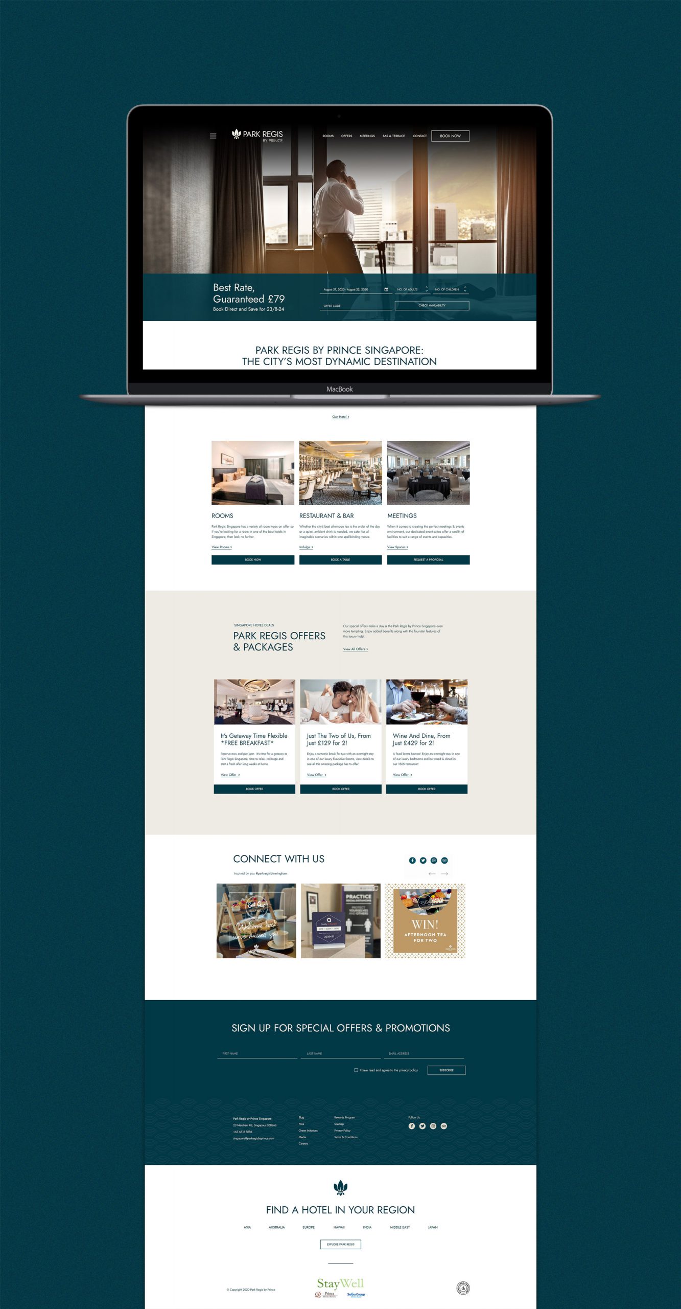
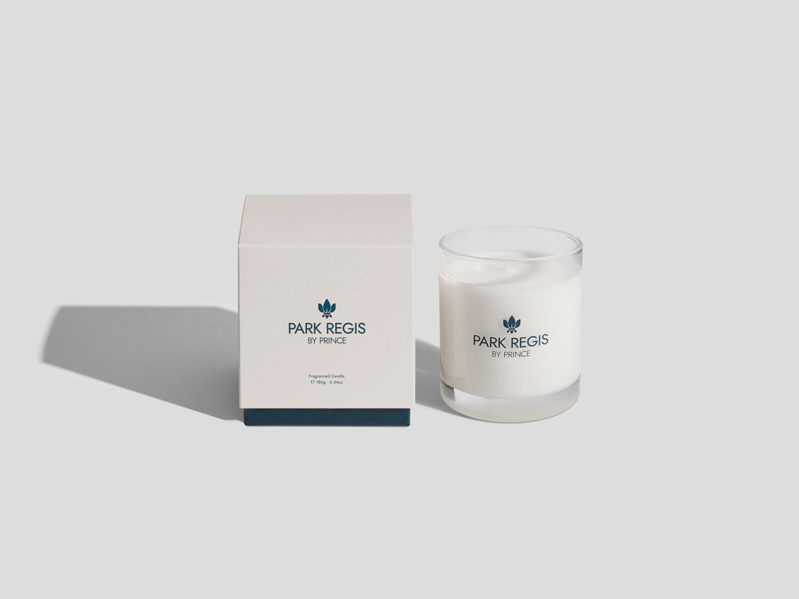
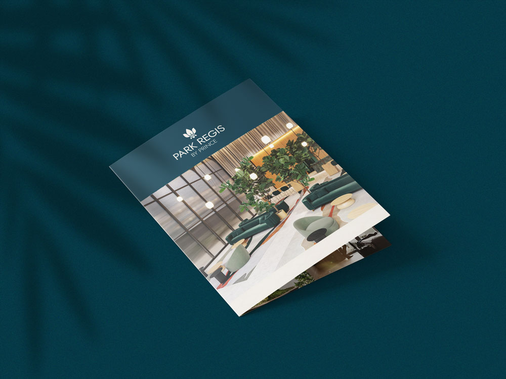
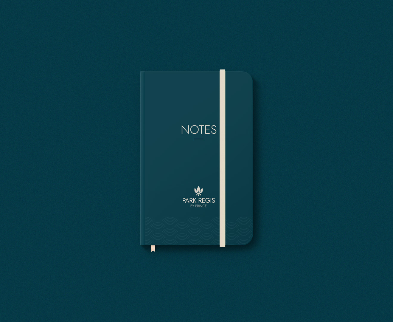
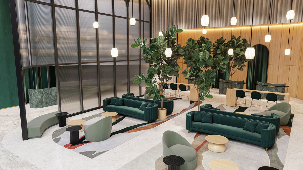
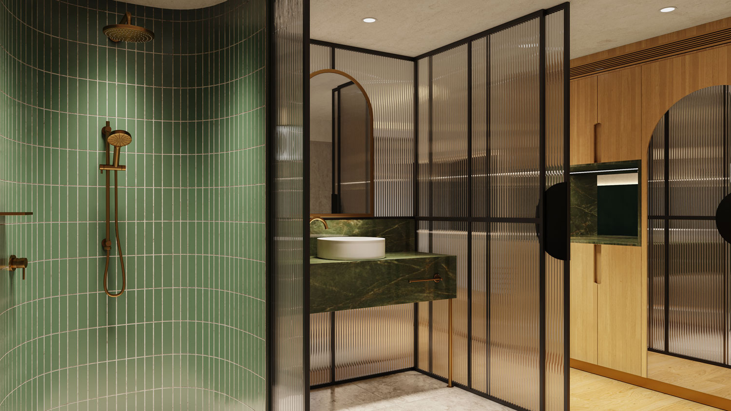
The identity is built around the motto “The World’s Most Thoughtful Hotels”, expressed through a design language that is polished, high-standard, and welcoming. Midnight Green conveys depth and passion, serving as the backdrop to the Fleur-de-Lys, now reimagined in a soft sand tone. A subtle wave pattern pays homage to the brand’s roots in Japan and Australia, while photography guidelines emphasise premium styling, natural warmth, and personal touches.
Together, these elements create a sophisticated identity that is warm, classic, and modestly upscale — a visual system that captures the thoughtful spirit of Park Regis by Prince as it steps confidently into its new era under Seibu Prince Hotels & Resorts.

