The triune brain applied to design
American neuroscientist Paul MacLean formulated the Triune Brain theory back in the 60s. Triune means three-in-one. MacLean suggested that the brain was organized in three distinct regions. Since then, his theory has been rejected. Brain imagery has proven that brain activity happens in various regions of the brain at the same time. However, MacLean’s model is still used in psychology because it offers a simplified version of the way the brain processes sensory information.
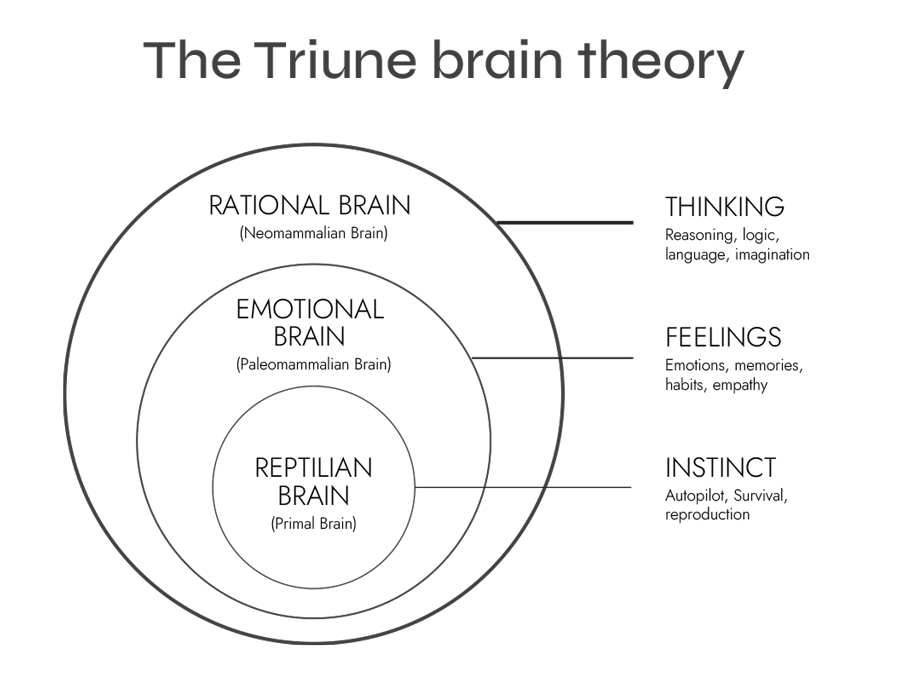
The triune brain model is based on an evolutionary view of the brain’s development. These are the three regions:
- Reptilian or Primal Brain (Basal Ganglia)
- Paleomammalian or Emotional Brain (Limbic System)
- Neomammalian or Rational Brain (Neocortex)
The primal brain
Also called reptilian brain, it controls our body functions, it is responsible for our orientation in space and for our instinctual behaviours and primal drives such as self-preservation and reproduction. The primal brain helps us distinguish between familiar and unfamiliar. This is the brain region controlling instinct and survival.
The emotional brain
Also referred to as the paleomammalian brain because of the development of this region early in mammalian evolution, it is responsible for motivation, emotion and memory formation. The emotional brain provides flexibility in our behaviour and enables us to monitor events in and outside our bodies to keep us safe. In short, it generates feelings and emotions.
The rational brain
Sometimes referred to as the smart brain, it is the part of the brain responsible for the ‘self’, for what makes ‘you’. It controls high order conscious activity such as language, learning, reasoning, problem-solving and creativity. It is the region of the brain that thinks and analyses.
 Why the triune brain model matters in design
This simple concept of the human having three brains is useful for designers because it helps understand how our users process sensory information and consequently, how to trigger an emotional response. Here are some examples of how designers can trigger the user’s desires.
Stimulating the primal brain
Ever wondered why an ad for a soft-drink or even a cleaning product displays a woman being sexualised? Well, sex sells. Our brain is wired to be aroused by attractive people, our primal brain that is. So by using attractive people in ads, designer are targeting our primal brain. It’s also the case when using food and drinks in ads as they are a primal need. So if you see an ad for anything unrelated to food or drinks but there is some in the picture, then your primal brain will identify a familiar sight and a necessary item for survival, and induce a positive emotion. Imagery is very important to stimulate de primal brain because of its instant subconscious processing. This is where before and after shots are effective in showing the effect of a product. As well, threatening signal such as a blinking red message that your cart will expire will trigger this part of your brain into taking action.
Stimulating the emotional brain
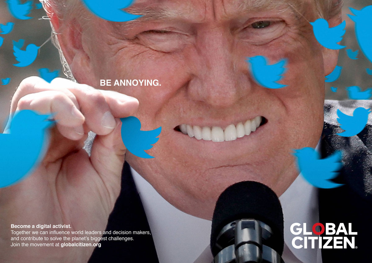
The emotional brain is the one that will fight with the rational brain (explained in the next section). Should I follow my heart or my reason? The emotional brain influences your experience of the world and your decisions by making you feel. This is where the designer will need to use appropriate imagery, colours, fonts and design elements to affect the user and influence their emotions. Think about ads for charities using pictures of distressed people in need, it pulls your heartstrings, it stimulates your emotional brain and induces empathy. Empathy works the same way when displaying smiling people, and makes you want that product which seems to make their users so happy.
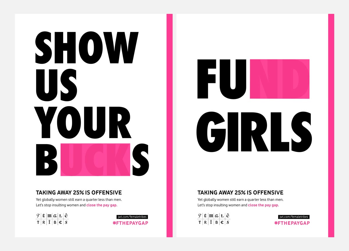
Colours and fonts will stimulate the emotional brain by calling on to its memory and associating a feeling to it. For instance, green is natural and pink is feminine. A round sans-serif font is modern, while a calligraphic font is traditional. These associations are subconscious and influence our vision of a brand and our decision on buying or not.
Stimulating the rational brain
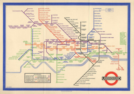
The rational brain is practical. It will analyse and contemplate in order to understand and decide. To appeal to the rational brain the designer needs to provide information to the user to guide him and help him make the right decision. However, the rational brain is a tough judge, so it’s critical to provide the information at the right place and at the right moment. We should never leave our user in the dark, nor we should overload them with data. Basically, the rational brain loves bullet points. A good example of design for the rational brain is pricing tables. They synthesize the information clearly, logically and even help in making the decision by showing what the best choice is. Where UI (User interface) acts on the emotional brain, UX (user experience) acts on the rational brain by giving information a hierarchy. The rational brain needs to be guided gently and smoothly, and can be nudged to induce a decision.
What you need to remember from this is that good design isn’t just a trendy font and a beautiful picture. Design, in essence, is sending a message to someone with a goal in mind. Whether it is to be known or to sell, reaching this goal will always mean that you are understood and liked, and this can only happen by triggering the right emotions through your user’s brain.


