The perception of colour
“Color is ubiquitous and is a source of information. People make up their minds within 90 seconds of their initial interactions with either people or products. So, prudent use of colors can contribute not only to differentiating products from competitors, but also to influencing moods and feelings – positively or negatively – and therefore, to attitude towards certain products. Given that our moods and feelings are unstable and that colors play roles in forming attitude, it is important that managers understand the importance of colors in marketing.”
– Psychologist Natalie Nahai (2012)
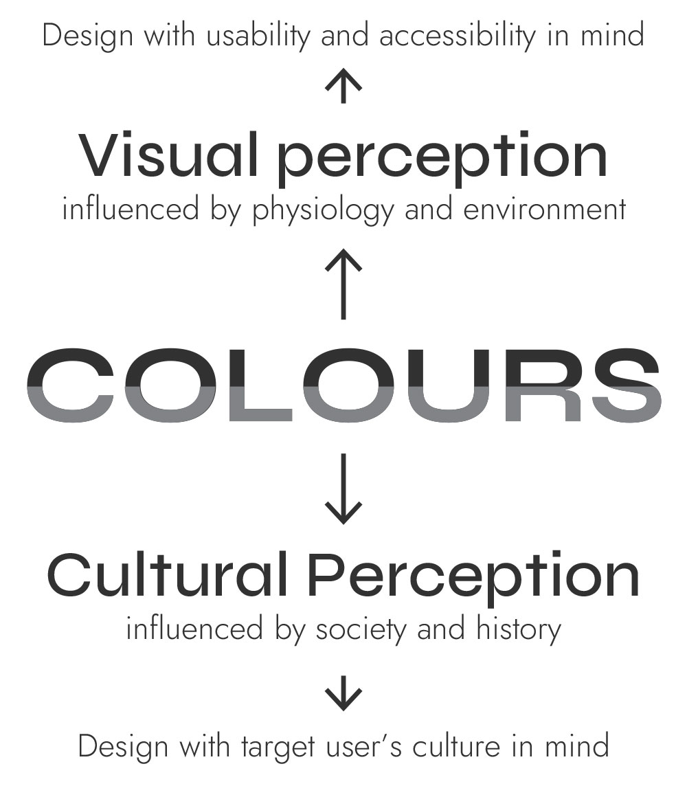
There are two types of perception to take into account when using colour in design:
– The visual perception
– The cultural perception
The visual perception
The visual perception varies between individuals and the designer should try to be as inclusive as possible. To make a product or software design accessible we have to think not just about our target user, but everyone. A user could be affected by colour-blindness or age-related loss of vision. Colour blindness affects around 8% of men and 0.5% of women, while contrast sensitivity starts decreasing between the ages of 40 and 50.
Physiological differences are not the only factors to take into account, context of use can alter the visual perception too. Think about the environment in which your product/software will be used: will it be low lit or bright? Will the user be in movement while using it? Will the light be of a specific colour? Coloured objects reflect only specific wavelengths of the colour spectrum. So, if you shine a red light on a red ball, the ball will look red, but if you shine a blue light on it, it will absorb the blue light and just look dark. You’d rarely need to worry about that, but think about drink coasters in a lounge bar or menus in a romantic restaurant lit up in red. You wouldn’t want your brand identity to loose its appeal because of a light bulb!


The cultural perception
The meaning of colours depends on a social and cultural formatting that can vary greatly between countries. For instance, the appropriate colour to wear when in mourning is black in Europe, but white in Vietnam. These habits and customs mean that colour can be used to stimulate a variety of emotional responses by triggering the user’s memory. Here is a short list of what colours evoke in western countries. You can see how I applied colour to branding for flexibility on the Park Proxi project page. Keep in mind again that the way colour makes us feel depends on each of us, our culture and story.

Red
Exciting and bold
Evokes strength, heat, love, passion

Yellow
Warm and optimistic
Evokes happiness, warmth, cheerfulness, youthfulness

Blue
Strong and dependable
Evokes water, hygiene, peace, serenity, security

Orange
Friendly and cheerful
Evokes enthusiasm, optimism but also caution

Green
Healthy and peaceful
Evokes nature, health, tranquillity, money, growth

Purple
Creative and imaginative
Evokes spirituality, imagination, wealth, wisdom, royalty
We process colour outside of conscious control. The perception is automatic and influences how we interpret everything. That’s why it’s a major design tool. Not only colour is important for usability reasons, to distinguish visual elements, but also for emotion. Using red to create a sense of urgency for instance. However, it is critical to understand that the psychology of colour isn’t universal to avoid any pitfalls.
A few colour tools I recommend:
https://coolors.co to create colour schemes
https://whocanuse.com to test colours for contrast and vision types
https://picular.co Google for colours
Sources: Emotional design lesson, IDF – Interaction design for usability lesson, IDF – www.webfx.com/blog/web-design/psychology-of-color-infographic


