How to build a brand people understand, remember and choose
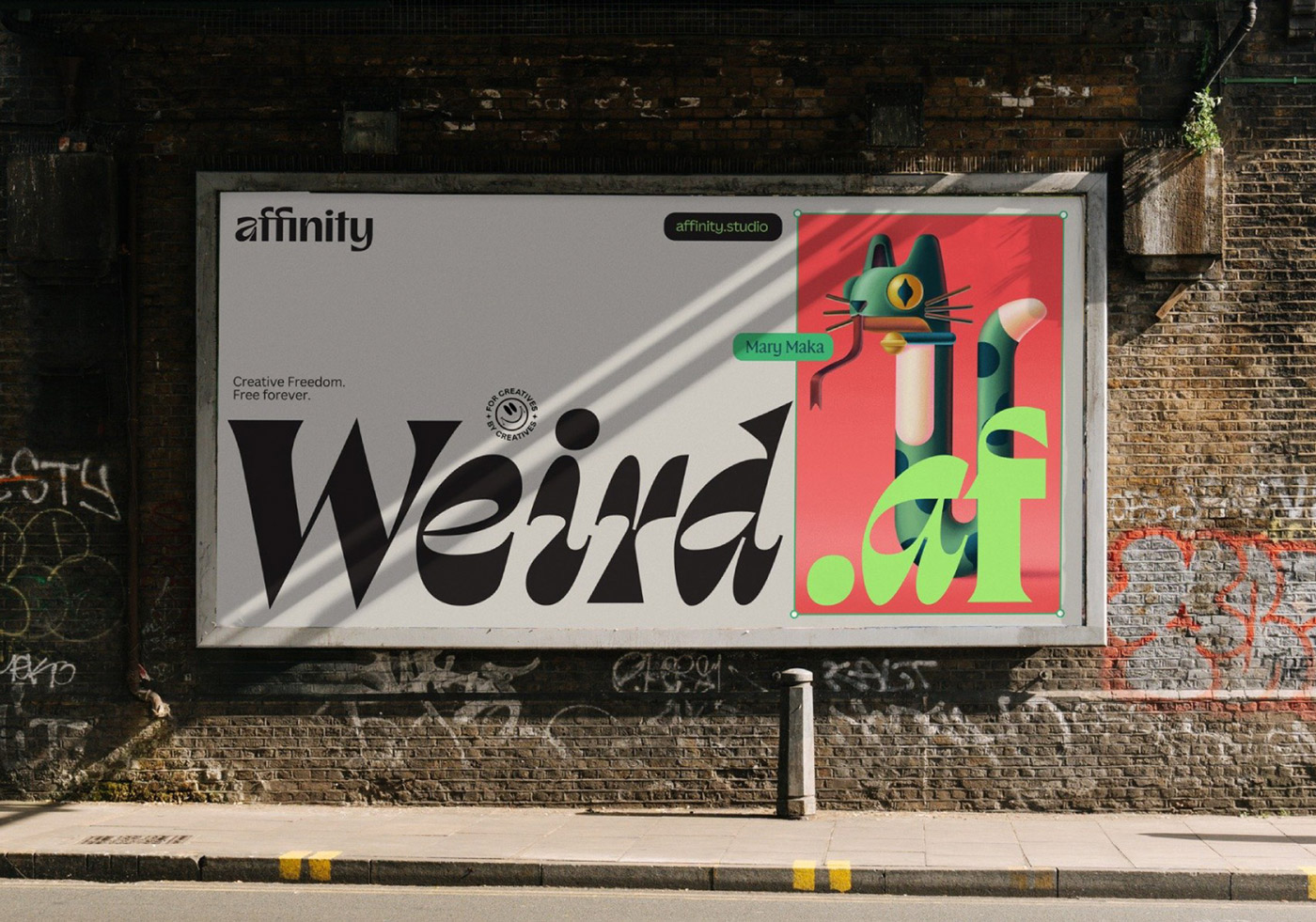
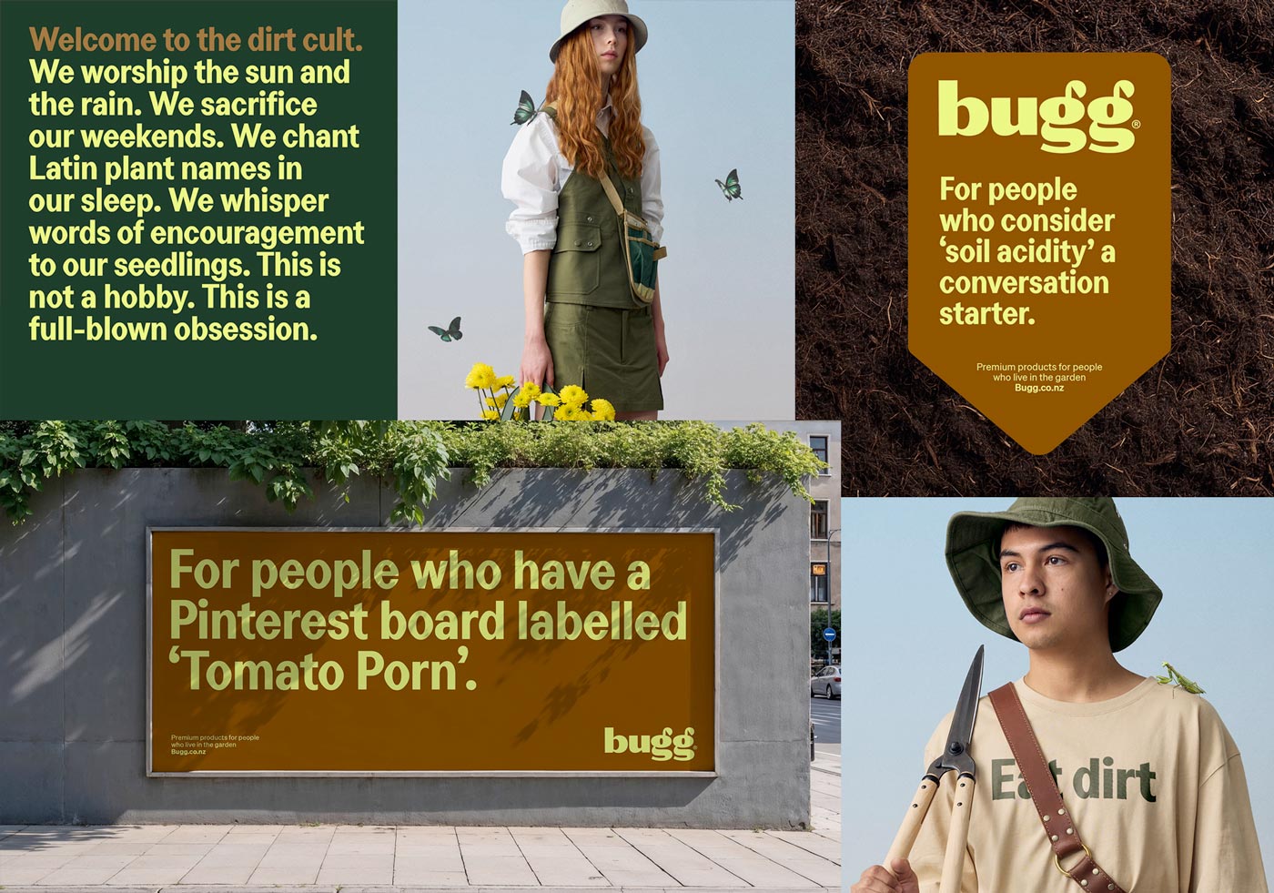
Pictured above: Where the strategy becomes visible. This billboard for Affinity Designer unifies the visual identity, the typography, the brand’s voice and copy into a single, recognisable expression.
Part I – What branding is
Branding starts long before anything is designed. It begins the moment a business becomes conscious of the role it wants to play and the experience it hopes to create. Even without visuals, without a logo, without a slogan or a website, a brand is already taking shape in the choices a business makes about its purpose, its values, and the kind of relationship it wants with the people it serves. Design, messaging, and tone are simply the outward expression of that understanding.
A brand offers a structure that makes a business easier to interpret. It lets people understand what they’re stepping into, what it might feel like to work with you, and how a decision in your direction could change something for them. Strength grows when clarity is carried consistently. Clarity keeps a business from drifting every time a new idea arrives, and consistency reinforces that clarity until it becomes familiar. Over time, impressions and experiences settle into memory, and that memory becomes the reason someone returns without needing to compare every option again. That is when recognition becomes preference.
And the reach of a brand is not limited to the public-facing world. The same principles that guide communication with customers should guide communication with partners, suppliers, and the people who work inside the business every day. A brand that behaves one way in marketing and another way internally becomes unstable; the experience fractures. Integrity is what holds a brand together: the decision to apply the same standards everywhere, from the sales call to the packaging table, from the boardroom to the staff room. When purpose, tone and behaviour remain aligned across every direction (B2C, B2B, and in-house) the brand becomes something people trust instinctively rather than conditionally.
Part II – How to define a brand
Defining a brand is about creating alignment between intention, communication and lived experience. Below is the structure that brings that alignment into being.
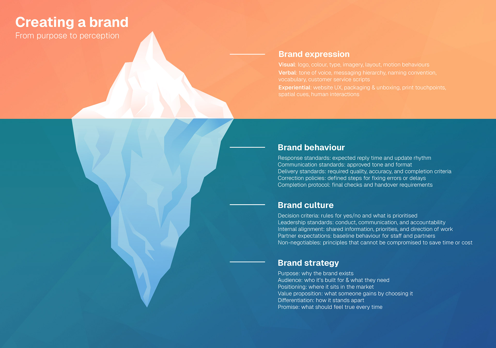
1. Purpose: why the brand exists
Begin with the role the business plays in someone’s life. Describe not only what you offer but the change you support. This does not need drama or poetry; it needs sincerity and direction. Purpose is the sentence that keeps you from wandering away from yourself.
A helpful starting line is:
We exist to help…
and the rest of the sentence should feel true, practical and human, something that would make sense to a customer.
To figure this out, ask yourself:
- What problem does the business reliably solve?
- What improvement or outcome does it create?
- What emotional state does the customer reach because of it?
- What identity does the customer want to step into?
2. Audience
People make decisions emotionally first, and logically second. To support that, understand the emotional conditions of choosing you:
- The moment they realise they need someone like you
- The hesitation that makes them pause
- The reassurance that would move them forward
- The feeling they want to claim by choosing you
A brand becomes relevant when it meets someone in the middle of that shift.
Brands often describe audiences as demographics: age, location, gender. But decisions are not made demographically, they are made emotionally. This is where practical insight matters: understanding what triggers the need, what slows the decision, and what creates reassurance. By focusing on context, not just profile, you build a brand that feels like an answer to something meaningful.
Practical exercises:
- Describe “the moment before” someone reaches for your brand. Describe “the moment after”.
- List three scenarios where your brand becomes relevant. Write what the customer is feeling in each. This becomes the emotional backbone of your messaging.
3. Positioning: your place in the market
Positioning gives the brand definition. It explains the circumstances in which you become the obvious choice. It is the difference between being available and being relevant. It removes the burden of competing everywhere by defining where you matter most.
A grounding prompt:
We become the right choice when someone is…
followed by the situation, feeling or need that aligns with your work.
Positioning is not a slogan but a direction. It allows every decision, from pricing to messaging to design, to point the same way.
- For whom are we the right choice?
- When do they need us?
- Why is our approach the most suitable in that moment?
4. Brand’s character and tone
Tone is the emotional texture of communication. It shapes how people feel while they engage with you. If clarity is the spine of the brand, tone is the nervous system; it carries the feeling through every interaction.
Choose a tone that holds the person well: firm or warm, calm or confident, spacious or energetic. Then, decide how that tone behaves when things are smooth, when things are uncertain, and when things demand care.
- How do we give instructions?
- How do we say no?
- How do we correct a misunderstanding?
- How do we celebrate progress?
Choose tone based on what reduces friction and builds trust. A financial advisor might need clarity and reassurance; a creative studio might need presence and ease; a wellness brand might need softness, steadiness and safety. Tone becomes a trust-building mechanism when it is carried consistently, not perfectly.
Practical output:
Write three example sentences (e.g. an email opening, a gentle correction, a celebration) that demonstrate this tone.
5. Visual system
When the strategy is clear, design finally has something to express. A visual identity is not decoration; it is semiotics: the use of shape, colour, rhythm and composition to communicate what we stand for without requiring explanation.
Instead of asking “what looks good?”, ask:
- What visuals express our purpose?
- What tone lives inside our typography?
- What elements reflects our personality?
- What imagery allows someone to recognise the brand by feeling, not just by logo?
A strong identity is one that feels inevitable in hindsight, as though it could not have been anything else. When identity works, people recognise the brand even when the logo isn’t visible.
To build this, define rules:
- When primary colours lead and when they support
- Which typefaces communicate structure vs. expression
- How layout and spacing shapes tone
- What emotions photography or illustration should reinforce
- When the logo enters and when it doesn’t
7. Bring it to life through behaviour
Behaviour is the bridge between expectation and experience. This is where customers build belief. And it’s often overlooked by small brands.
The visual identity may catch someone’s eye, but the behaviour of the brand determines whether they ever come back. Behaviour is the lived experience of the brand: the tone of your replies, the clarity of your onboarding, the way you handle confusion, the pressure you remove from decision-making, and the care people feel when things don’t go perfectly.
- How you welcome
- How you reply
- How you onboard
- How you apologise
- How you celebrate
- How you say goodbye
Behaviour is where the brand becomes real.
Part III – The output: your brand guidelines
At its core, documentation gives the brand one place to live.
Mistakes to avoid
Mistake 1: Starting with visuals before meaning
Mistake 2: Speaking to everyone
Mistake 3: Reinventing too often
Mistake 4: Copying the category
Mistake 5: Treating behaviour as customer service
Conclusion
When you clarify why you exist, who you support, when you matter, and how you behave, your brand stops competing for attention and starts earning recognition.
- Say less, mean more. Clarity is more powerful than volume.
- Design for recall, not novelty.
- Deliver what you promise.