Building an Effective Landing Page
In today’s digital age, communication is omnichannel, and all the touchpoints you create will usually lead to landing pages, the last step to converting the visitor into a customer. A well-crafted landing page can significantly impact the success of your marketing campaigns. By following a proven framework using a hook, meat, and a CTA, you can create landing pages that engage and persuade your audience to take action.
I. The Hook: Grabbing Attention from the First Glance
The initial seconds of a visitor’s interaction with your landing page are crucial. To create a compelling hook, focus on the following elements:
- Clear Value Proposition: Communicate the unique benefits of your offer concisely. Use attention-grabbing headlines and subheadings to clearly convey the value visitors can expect to receive. Your page H1 has to be your hook, mentioning the outcome or the pain.
- Engaging Visuals: Incorporate eye-catching images, videos, or infographics that align with your message and resonate with your target audience.
- Above-the-Fold Optimization: Place essential elements, such as your headline, CTA, and key benefits, in the upper section of the page. Users make quick decisions, so optimize this prime real estate to capture their attention.
II. The Meat: Crafting a Compelling Story and Demonstrating Value
Once you have hooked your audience, it’s time to provide them with the necessary information to make an informed decision.
- Engaging Copy: Write compelling, concise, and benefit-oriented copy that resonates with your target audience. Focus on addressing their pain points and clearly articulate how your product or service can solve their problems.
- Social Proof: Incorporate testimonials, case studies, reviews, or client logos to build trust and credibility. People are more likely to take action when they see that others have had positive experiences with your offering.
- Visual Hierarchy and Design: Utilize a clean and visually appealing design that guides the user’s attention to the most important elements. Effective use of white space, contrasting colors, and proper typography can significantly enhance the user experience.
- Storytelling: Connect with your audience on an emotional level by sharing a compelling narrative. Craft a story that relates to their struggles and demonstrates how your product or service transformed someone’s life.
III. The CTA: Compelling Call-to-Action for Conversions
The call-to-action (CTA) is the final step in persuading your visitors to take the desired action.
- Clear and Actionable: Use concise and compelling language in your CTA button, conveying a sense of urgency and encouraging immediate action.
- Strategic Placement: Position your CTA in a prominent location on the page, ensuring it stands out from other elements. Test different placements to find what works best for your target audience.
- A/B Testing: Continuously experiment with different CTAs, colors, button sizes, and wording to optimize your conversion rate. A/B testing allows you to gather data and make informed decisions based on user behavior. It’s an absolute must! But always test one thing at a time, ie the picture or the text, not both.
Additional Components for Success
To maximize the effectiveness of your landing page, consider incorporating the following elements:
- Trust Indicators: Display trust badges, security seals, or certifications to alleviate any concerns visitors may have regarding the safety and credibility of your offering.
- FAQs: Anticipate common questions and provide clear and concise answers to alleviate any doubts visitors may have. FAQs demonstrate your expertise and dedication to customer satisfaction.
- Lead Capture: Implement lead capture forms strategically. Request only essential information and consider offering an incentive, such as a free e-book or discount, to encourage sign-ups.
- Mobile Optimization: With the increasing use of mobile devices, ensure your landing page is fully optimized for mobile responsiveness. Mobile users should have a seamless experience that matches the quality of desktop users.
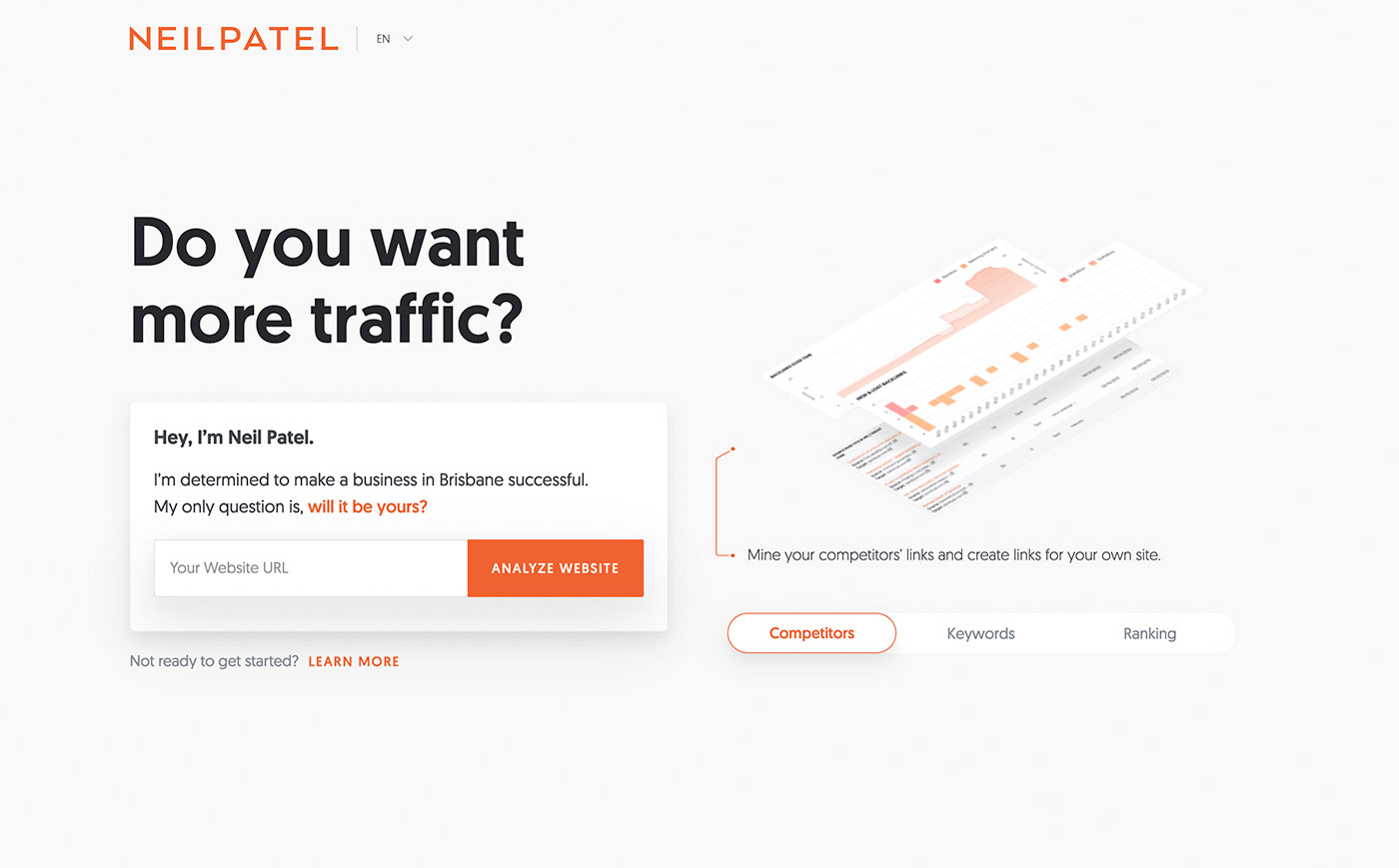
Remember, the key to success lies in continuously analyzing and adapting your landing pages to fit your audience’s needs. Keep experimenting, tracking metrics, and refining your approach to ensure your landing pages are always effective and aligned with your marketing goals. Need to see some examples? Marketing Guru Neil Patel has a blog post with some examples here. And below is a screenshot of a Software landing page, a benchmark in landing pages in my opinion!


